Sharpe Bold
Designed by Jeremy Dooley
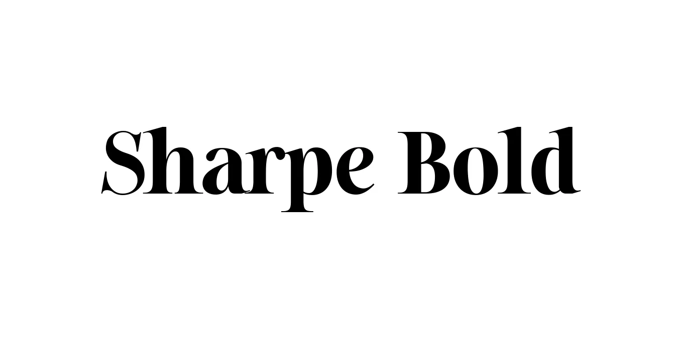
| Font Name | Sharpe PERSONAL |
| Style | Bold |
| Category | Serif |
| Designer | Jeremy Dooley |
| Copyright | Copyright (c) 2019 by Mans Greback. All rights reserved. |
| License | Free for Personal Use |
| Total Character | 362 |
| Recommended Line Height | 1.34 |
| Ascent | 1030 |
| Descent | 308 |
| Units Per em | 1000 |
| Total Vertical Range | 1338 |
| Max Advance Width | 1791 |
| Max Advance Height | N/A |
| Underline Position | -75 |
| Similar Fonts | Playfair Display, Bodoni, Baskerville, Didot |
Sharpe Bold Font Details : Font Free Download
Sharpe Bold is a sophisticated high-contrast serif typeface designed by Jeremy Dooley. Released as part of the larger Sharpe family, this font draws heavy inspiration from the elegant lettering of the late 19th and early 20th centuries, particularly the refined styles found in British publishing. It balances classic proportions with a contemporary sharpness, making it a versatile choice for designers looking to convey authority and grace in their visual communications.
The typeface is characterized by its sharp terminals and dramatic stroke transitions, which give it a distinctively modern flair despite its historical roots. Whether used in high-end fashion magazines or corporate branding, Sharpe Bold provides a commanding presence that captures attention without sacrificing legibility. Its robust construction ensures that it remains clear and impactful across both digital and print mediums.
Sharpe Bold Best Uses
Perfect for high-impact headlines in magazines and digital newspapers.
Ideal for luxury brands and sophisticated corporate identities.
Adds a refined and premium touch to website headers and hero sections.
Excellent for high-end product labels, particularly in fashion and cosmetics.
Creates bold, elegant statements in print and digital marketing campaigns.
Sharpe Bold Glyphs
