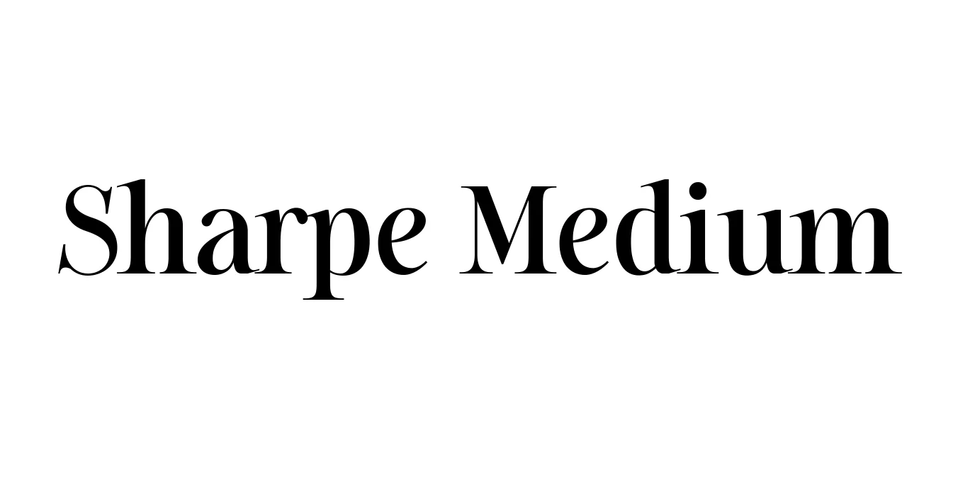
Sharpe Medium
Designed by Jeremy Dooley
| Font Name | Sharpe PERSONAL |
| Style | Medium |
| Category | Serif |
| Designer | Jeremy Dooley |
| Copyright | Copyright (c) 2019 by Mans Greback. All rights reserved. |
| License | Free for Personal Use / Demo |
| Total Character | 362 |
| Recommended Line Height | 1.34 |
| Ascent | 1030 |
| Descent | 308 |
| Units Per em | 1000 |
| Total Vertical Range | 1338 |
| Max Advance Width | 1791 |
| Max Advance Height | N/A |
| Underline Position | -75 |
| Similar Fonts | Bodoni, Didot, Playfair Display, Caslon |
Sharpe Medium Font Details : Font Free Download
Sharpe Medium is a sophisticated high-contrast serif typeface designed by Jeremy Dooley and released through the insigne foundry. Drawing inspiration from the refined aesthetics of the late 19th century, the font family balances sharp, wedge-like serifs with elegant, fluid curves. This specific medium weight provides a versatile middle ground, offering enough substance for readability while maintaining the distinct, sharp personality that gives the family its name.
Developed for high-end applications, Sharpe is often utilized in luxury branding and premium editorial layouts. Its architectural structure and polished finishes make it a favorite for designers looking to convey authority and grace. Since its release, the Sharpe family has become a staple for professional projects requiring a touch of modern classicism and sharp typographic precision.
Sharpe Medium Best Uses
Perfect for magazine spreads and high-end print publications.
Ideal for luxury fashion and high-end corporate identities.
Creates striking and authoritative titles in both web and print.
Great for sophisticated aesthetic posts and elegant typography.
Sharpe Medium Glyphs
