Skidoo Fat
Designed by David Rakowski
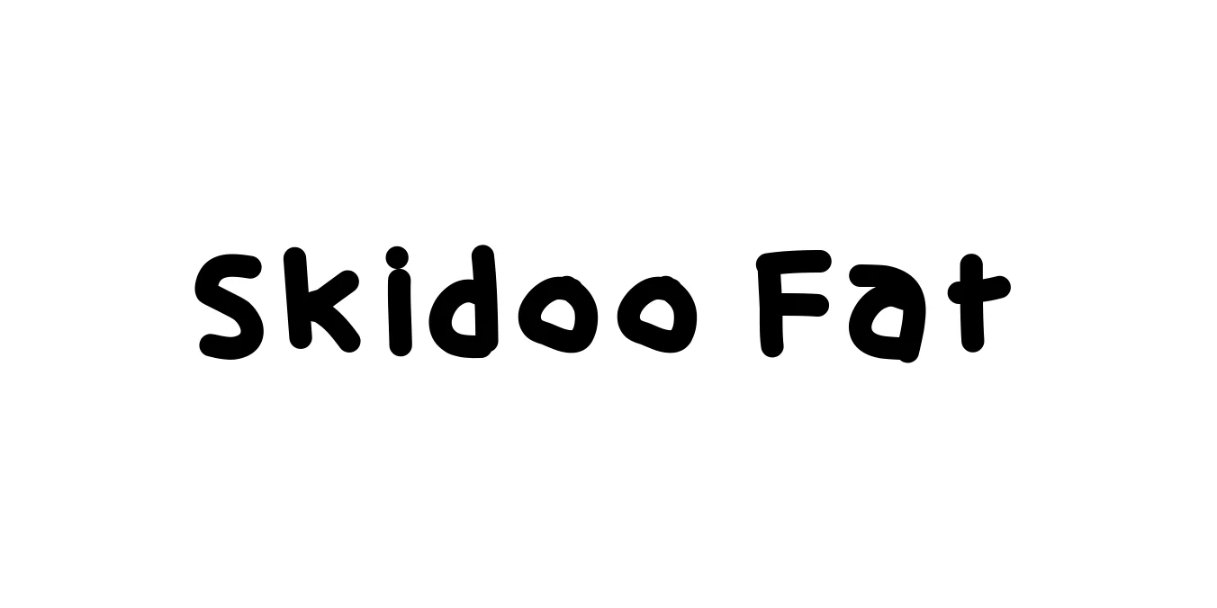
| Font Name | Skidoo |
| Style | Fat |
| Category | Display |
| Designer | David Rakowski |
| Copyright | Skid |
| License | Free for Personal Use |
| Total Character | 112 |
| Recommended Line Height | 1.11 |
| Ascent | 874 |
| Descent | 232 |
| Units Per em | 1000 |
| Total Vertical Range | 1106 |
| Max Advance Width | 1257 |
| Max Advance Height | N/A |
| Underline Position | -125 |
| Similar Fonts | Cooper Black, Blippo, Comic Sans |
Skidoo Fat Font Details : Font Free Download
Skidoo Fat is a high-impact, heavyweight display typeface designed by David Rakowski during the early 1990s. Characterized by its chunky, rounded forms and casual, hand-lettered aesthetic, it captures the playful energy of the shareware font movement. The typeface features extremely thick strokes with minimal counters, making it a bold choice for designs that require a sense of fun and spontaneity without sacrificing visual weight.
The font is often associated with retro comic book styling and 90s graphic design trends. Because of its massive footprint and expressive outlines, Skidoo Fat excels in environments where legibility is secondary to personality. It has remained a cult favorite among designers seeking to evoke a nostalgic, informal, or slightly eccentric vibe in their creative layouts.
Skidoo Fat Best Uses
Ideal for massive, eye-catching titles on posters and flyers.
Perfect for sound effect lettering and bold character-driven titles.
Great for quirky logos and playful identity systems.
Works well for t-shirt graphics that need a thick, hand-drawn look.
Skidoo Fat Glyphs
