Söhne Bold
Designed by Kris Sowersby
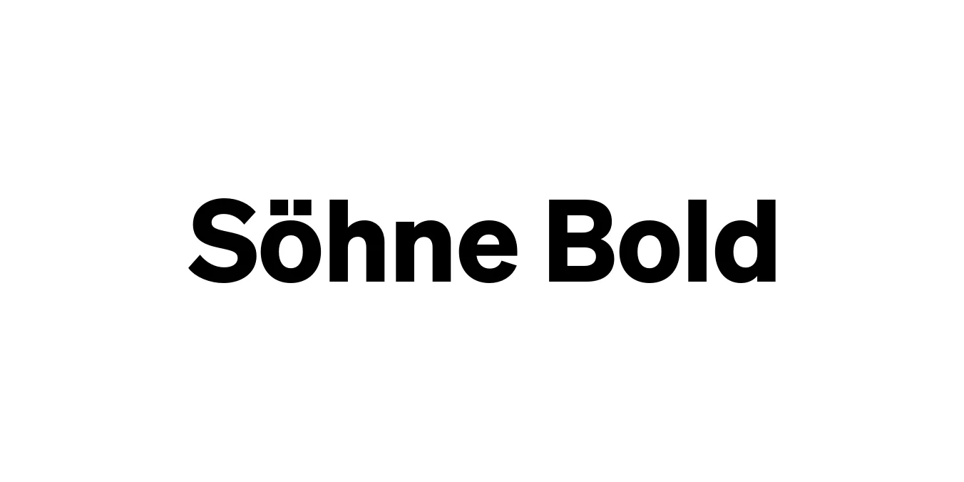
| Font Name | Test Söhne |
| Style | Bold |
| Category | Sans Serif |
| Designer | Kris Sowersby |
| Copyright | Copyright 2023, Kris Sowersby, Klim Type Foundry. |
| License | Free for Personal Use |
| Total Character | 68 |
| Recommended Line Height | 1.33 |
| Ascent | 1037 |
| Descent | 289 |
| Units Per em | 1000 |
| Total Vertical Range | 1326 |
| Max Advance Width | 1035 |
| Max Advance Height | N/A |
| Underline Position | -16 |
| Similar Fonts | Akzidenz-Grotesk, Helvetica, San Francisco, Inter |
Söhne Bold Font Details : Font Free Download
Söhne Bold is a foundational part of the Söhne collection, designed by Kris Sowersby and released through the Klim Type Foundry. It serves as a modern interpretation of Akzidenz-Grotesk, capturing the essence of the typeface as it appeared in iconic Swiss design. This specific weight is engineered to maintain the industrial spirit of the original while refining its proportions for contemporary digital and print environments.
The typeface excels in its ability to feel both historical and futuristic, bridging the gap between mid-century modernism and today's high-resolution screen requirements. Söhne Bold provides a robust, authoritative presence that is ideal for designers who require a grotesque sans-serif with a sophisticated, intellectual edge. Its meticulous spacing and character construction ensure it remains legible even in demanding layouts.
Söhne Bold Best Uses
Ideal for creating a strong, stable, and professional brand identity.
Perfect for high-impact headlines and subheaders in magazines.
Provides a clean and legible hierarchy for modern user interfaces.
The bold weight commands attention in both print and digital ads.
Söhne Bold Glyphs

Download Font
Package Size: Unknown
Available Formats: .OTF