Söhne Breit Bold
Designed by Kris Sowersby
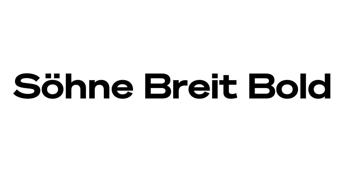
| Font Name | Test Söhne Breit |
| Style | Bold |
| Category | Sans Serif |
| Designer | Kris Sowersby |
| Copyright | Copyright 2023, Kris Sowersby, Klim Type Foundry. |
| License | Commercial License (Requires purchase from Klim Type Foundry) |
| Total Character | 68 |
| Recommended Line Height | 1.33 |
| Ascent | 1037 |
| Descent | 289 |
| Units Per em | 1000 |
| Total Vertical Range | 1326 |
| Max Advance Width | 1431 |
| Max Advance Height | N/A |
| Underline Position | -12 |
| Similar Fonts | Akzidenz-Grotesk, Helvetica, Univers, Unica77, National 2 |
Söhne Breit Bold Font Details : Font Free Download
Söhne Breit Bold is a prominent extension of the Söhne collection, designed by the renowned Kris Sowersby of Klim Type Foundry. It serves as a typographic 'memory' of Akzidenz-Grotesk, specifically capturing the materiality and atmosphere of the New York City Subway signage. This 'Breit' (wide) variant emphasizes horizontal expansion, providing a robust and authoritative presence that balances historical industrialism with sophisticated digital precision.
The typeface is characterized by its neutral tone and clear construction, making it a staple for modern Swiss-style design. As a bold weight within the wide family, it excels in high-impact environments where legibility and character are equally prioritized. By bridging the gap between mid-century grots and contemporary display needs, Söhne Breit Bold remains a versatile tool for designers aiming for a timeless yet modern aesthetic.
Söhne Breit Bold Best Uses
Creating powerful, authoritative brand identities with a modern edge.
Commanding headlines and title sequences in premium magazines.
Impactful hero sections and bold user interface elements.
Large-scale environmental graphics and wayfinding systems.
Söhne Breit Bold Glyphs

Download Font
Package Size: Unknown
Available Formats: .OTF