Söhne Breit Bold Italic
Designed by Kris Sowersby
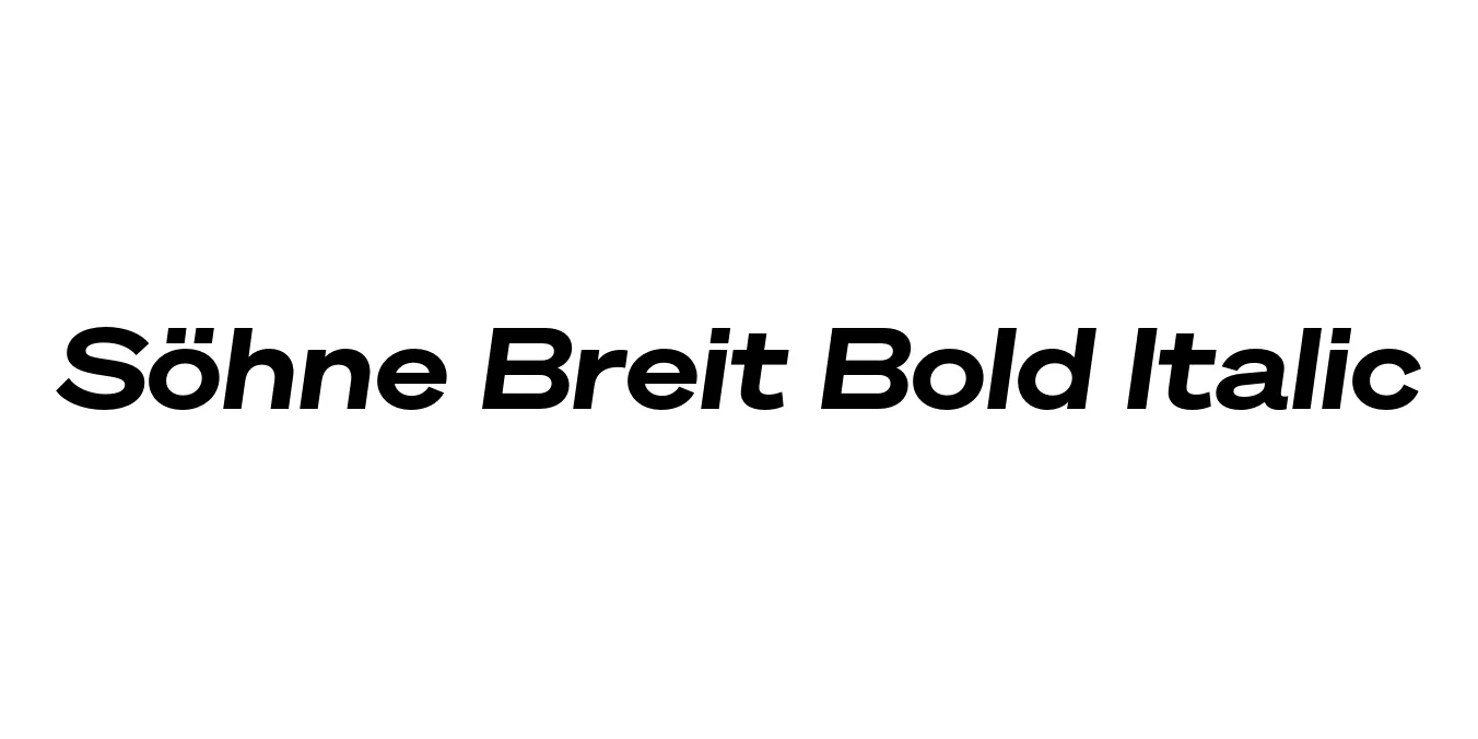
| Font Name | Test Söhne Breit |
| Style | Bold Italic |
| Category | Sans Serif |
| Designer | Kris Sowersby |
| Copyright | Copyright 2023, Kris Sowersby, Klim Type Foundry. |
| License | Commercial / Paid License Required |
| Total Character | 68 |
| Recommended Line Height | 1.33 |
| Ascent | 1037 |
| Descent | 289 |
| Units Per em | 1000 |
| Total Vertical Range | 1326 |
| Max Advance Width | 1435 |
| Max Advance Height | N/A |
| Underline Position | -12 |
| Similar Fonts | Akzidenz-Grotesk Extended, Helvetica Now, Univers, San Francisco |
Söhne Breit Bold Italic Font Details : Font Free Download
Söhne Breit Bold Italic is a meticulous evolution of the classic grotesque, designed by Kris Sowersby of Klim Type Foundry. It draws heavy inspiration from the 'analogue materiality' of Akzidenz-Grotesk, particularly the version used in the New York City Subway system. The 'Breit' or wide variant expands the typeface’s horizontal footprint, offering a sense of architectural stability and expansive presence that is both commanding and sophisticated.
This Bold Italic weight brings a dynamic, powerful energy to the Söhne family. It balances the industrial heritage of early sans-serifs with a refined, contemporary finish that works seamlessly across digital and print mediums. Its wide proportions and slanted orientation make it an exceptional choice for designers who need to convey motion and authority simultaneously, ensuring that every character feels purposeful and grounded.
Söhne Breit Bold Italic Best Uses
Perfect for wide, impactful titles that require a sense of urgency and authority.
Ideal for modern corporate identities and luxury tech brands looking for a unique profile.
Excellent for large-scale outdoor signage where readability and scale are essential.
Highly effective for hero sections and bold navigation menus on high-end portfolios.
Söhne Breit Bold Italic Glyphs

Download Font
Package Size: Unknown
Available Formats: .OTF