Söhne Breit Extrafett Regular
Designed by Kris Sowersby (Klim Type Foundry)
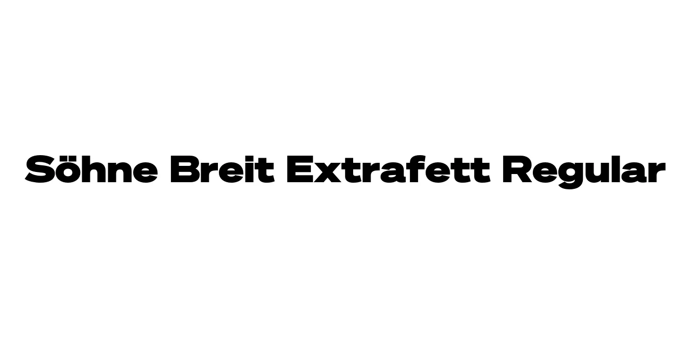
| Font Name | Test Söhne Breit Extrafett |
| Style | Regular |
| Category | Sans Serif |
| Designer | Kris Sowersby (Klim Type Foundry) |
| Copyright | Copyright 2023, Kris Sowersby, Klim Type Foundry. |
| License | Commercial License Required |
| Total Character | 68 |
| Recommended Line Height | 1.33 |
| Ascent | 1037 |
| Descent | 289 |
| Units Per em | 1000 |
| Total Vertical Range | 1326 |
| Max Advance Width | 1466 |
| Max Advance Height | N/A |
| Underline Position | 30 |
| Similar Fonts | Akzidenz-Grotesk, Unica77, NHG Display, Helvetica |
Söhne Breit Extrafett Regular Font Details : Font Free Download
Söhne Breit Extrafett Regular is a commanding presence within the Söhne collection, a typeface family that serves as a modern homage to the legendary Akzidenz-Grotesk. Developed by the award-winning Klim Type Foundry, the 'Breit' (Wide) variant expands the horizontal proportions of the letters, while 'Extrafett' represents its most robust, heavy-weight incarnation. This combination results in a typeface that captures the physical presence of industrial signage with refined, digital-first craftsmanship.
The design of Söhne Breit is deeply rooted in the 'material reality' of the New York City subway system, specifically the signage adapted by Massimo Vignelli and Bob Noorda. By widening the stance and maximizing the weight, Extrafett Regular becomes an ideal tool for cinematic display use. It maintains the neutrality of the International Typographic Style while adding a layer of contemporary drama and authority, making it a staple for high-end editorial and corporate identity systems.
Söhne Breit Extrafett Regular Best Uses
Maximum impact for large-scale print and digital titles.
Provides a strong, horizontal foundation for modern brand marks.
Commands immediate attention in high-contrast advertising.
Creates a dramatic and authoritative focal point for website headers.
Söhne Breit Extrafett Regular Glyphs
