Söhne Breit Extraleicht Italic
Designed by Kris Sowersby
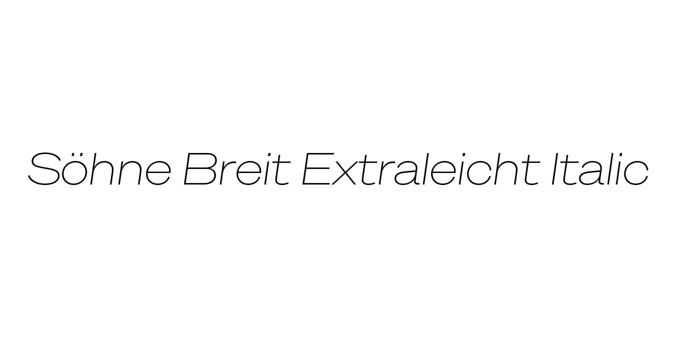
| Font Name | Test Söhne Breit Extraleicht |
| Style | Italic |
| Category | Sans Serif |
| Designer | Kris Sowersby |
| Copyright | Copyright 2023, Kris Sowersby, Klim Type Foundry. |
| License | Demo / Free for Personal Use |
| Total Character | 68 |
| Recommended Line Height | 1.33 |
| Ascent | 1037 |
| Descent | 289 |
| Units Per em | 1000 |
| Total Vertical Range | 1326 |
| Max Advance Width | 1387 |
| Max Advance Height | N/A |
| Underline Position | -140 |
| Similar Fonts | Akzidenz-Grotesk, Helvetica, Unica77, San Francisco, Univers |
Söhne Breit Extraleicht Italic Font Details : Font Free Download
Söhne Breit Extraleicht Italic is a refined extension of the Söhne typeface family, designed by the acclaimed Kris Sowersby of the Klim Type Foundry. Söhne is often described as the 'memory' of Akzidenz-Grotesk, capturing the spirit of the legendary typeface while refining its proportions for contemporary digital and print environments. The 'Breit' classification indicates a wide horizontal expansion, while 'Extraleicht' signifies an extra-light weight, resulting in a typeface that feels both expansive and delicate. The italic variation adds a sophisticated sense of motion and urgency to the wide, airy letterforms.
As a Neo-Grotesk masterpiece, this font excels in balancing neutrality with a distinct personality. Its wide stance makes it particularly effective for large-scale display use, where the subtle details of its construction can be fully appreciated. Whether used in high-end editorial layouts or minimalist branding projects, Söhne Breit Extraleicht Italic provides a sense of modern authority and technical precision. It is a tool designed for typographers who require a typeface that is both functional and expressive, bridging the gap between historical heritage and futuristic design.
Söhne Breit Extraleicht Italic Best Uses
Perfect for sophisticated magazine headers and pull-quotes in fashion or art publications.
Ideal for luxury brand logos that require a minimalist yet expansive aesthetic.
Great for clean, high-resolution hero sections and spacious landing pages.
Excellent for large-scale signage where a modern, airy feel is desired.
Söhne Breit Extraleicht Italic Glyphs

Download Font
Package Size: Unknown
Available Formats: .OTF