Söhne Breit Fett Regular
Designed by Kris Sowersby
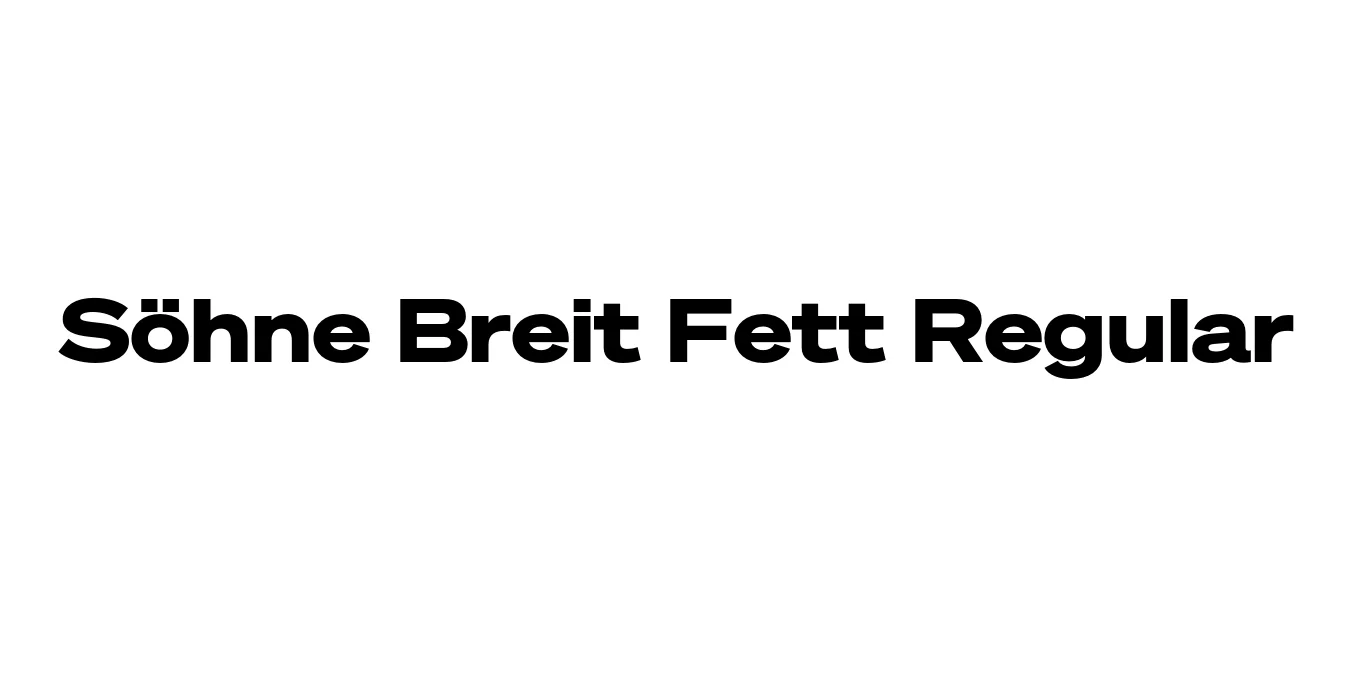
| Font Name | Test Söhne Breit Fett |
| Style | Regular |
| Category | Sans Serif |
| Designer | Kris Sowersby |
| Copyright | Copyright 2023, Kris Sowersby, Klim Type Foundry. |
| License | Free for Personal Use |
| Total Character | 68 |
| Recommended Line Height | 1.33 |
| Ascent | 1037 |
| Descent | 289 |
| Units Per em | 1000 |
| Total Vertical Range | 1326 |
| Max Advance Width | 1448 |
| Max Advance Height | N/A |
| Underline Position | 8 |
| Similar Fonts | Akzidenz-Grotesk, Helvetica, Univers, Unica77 |
Söhne Breit Fett Regular Font Details : Font Free Download
Söhne Breit Fett is a powerful, wide, and bold expression within the Söhne family, meticulously crafted by Kris Sowersby of the Klim Type Foundry. This typeface represents a contemporary evolution of the classic Akzidenz-Grotesk, capturing its industrial essence while smoothing out its historical quirks for modern digital and print environments. The "Breit" (Wide) and "Fett" (Bold) designation ensures a high-impact presence that demands attention in any design layout.
Functionally, Söhne Breit Fett is engineered for structural clarity and maximum legibility in display contexts. It bridges the gap between the raw, analog energy of early Swiss typography and the precision of 21st-century type design. Its expansive horizontal proportions and heavy weight make it an essential tool for designers looking to create authoritative branding, bold editorial spreads, and distinctive visual identities that stand the test of time.
Söhne Breit Fett Regular Best Uses
Ideal for massive, attention-grabbing titles in magazines and posters.
Perfect for creating strong, authoritative corporate identity systems.
Excellent for architectural graphics and high-visibility wayfinding.
Great for hero sections and high-impact landing page statements.
Söhne Breit Fett Regular Glyphs

Download Font
Package Size: Unknown
Available Formats: .OTF