Söhne Breit Halbfett Italic
Designed by Kris Sowersby
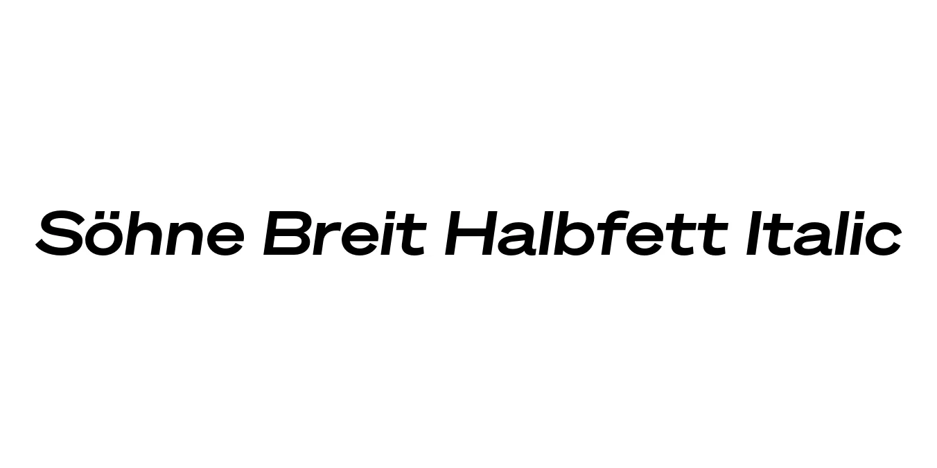
| Font Name | Test Söhne Breit Halbfett |
| Style | Italic |
| Category | Sans Serif |
| Designer | Kris Sowersby |
| Copyright | Copyright 2023, Kris Sowersby, Klim Type Foundry. |
| License | Commercial License Required |
| Total Character | 68 |
| Recommended Line Height | 1.33 |
| Ascent | 1037 |
| Descent | 289 |
| Units Per em | 1000 |
| Total Vertical Range | 1326 |
| Max Advance Width | 1421 |
| Max Advance Height | N/A |
| Underline Position | -26 |
| Similar Fonts | Akzidenz-Grotesk, Unica77, Helvetica Now, Univers |
Söhne Breit Halbfett Italic Font Details : Font Free Download
Söhne Breit Halbfett Italic is a masterful expression of the modern grotesque, designed by Kris Sowersby of the Klim Type Foundry. As part of the broader Söhne family, it represents the memory of Akzidenz-Grotesk adapted for the digital age, stripping away historical idiosyncrasies to achieve a clean, functional, yet deeply charismatic aesthetic.
The Halbfett weight offers a semi-bold density that commands attention without the bulk of a heavy black weight, while the Breit (wide) width stretches the letterforms horizontally for a more expansive, cinematic feel. The italic slant is precisely engineered to maintain the typeface's structural integrity, providing a sense of motion and urgency that makes it ideal for sophisticated editorial and high-end branding applications.
Söhne Breit Halbfett Italic Best Uses
Ideal for creating strong, wide-set logos that require a sense of permanence and authority.
Perfect for striking pull-quotes and emphasized headings in luxury fashion or architecture magazines.
Effective for high-impact headlines and billboards where horizontal space allows for expressive width.
Excellent for hero sections and navigation menus on minimalist, modern websites.
Söhne Breit Halbfett Italic Glyphs

Download Font
Package Size: Unknown
Available Formats: .OTF