Söhne Breit Italic
Designed by Kris Sowersby
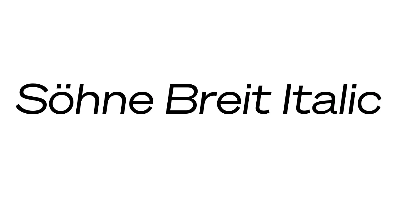
| Font Name | Test Söhne Breit |
| Style | Italic |
| Category | Sans Serif |
| Designer | Kris Sowersby |
| Copyright | Copyright 2023, Kris Sowersby, Klim Type Foundry. |
| License | Demo / Personal Use Only |
| Total Character | 68 |
| Recommended Line Height | 1.33 |
| Ascent | 1037 |
| Descent | 289 |
| Units Per em | 1000 |
| Total Vertical Range | 1326 |
| Max Advance Width | 1387 |
| Max Advance Height | N/A |
| Underline Position | -77 |
| Similar Fonts | Akzidenz-Grotesk, Helvetica, Univers, Inter, National |
Söhne Breit Italic Font Details : Font Free Download
Söhne Breit Italic is a distinguished member of the Söhne collection, designed by Kris Sowersby of the Klim Type Foundry. It represents a meticulous exploration of the neo-grotesque genre, drawing direct inspiration from the legendary Akzidenz-Grotesk. The 'Breit' variant specifically focuses on an expanded width, providing a sense of authority and structural stability that is perfectly complemented by the dynamic energy of its slanted italic forms.
This typeface captures the 'memory' of Helvetica and its predecessors while refining the proportions for contemporary digital and print environments. By balancing the rigid geometry of the wide architecture with the subtle rhythm of the italic style, Söhne Breit Italic offers a sophisticated aesthetic that feels both nostalgic and forward-thinking, making it a staple for high-end editorial layouts and corporate identity systems.
Söhne Breit Italic Best Uses
Ideal for creating strong, wide logos that command attention and authority.
Perfect for headlines and pull quotes in high-fashion and design magazines.
Effective for bold hero sections and large-scale typography in web design.
The wide, clear forms make it highly legible for architectural signage.
Söhne Breit Italic Glyphs

Download Font
Package Size: Unknown
Available Formats: .OTF