Söhne Breit Kräftig Italic
Designed by Kris Sowersby
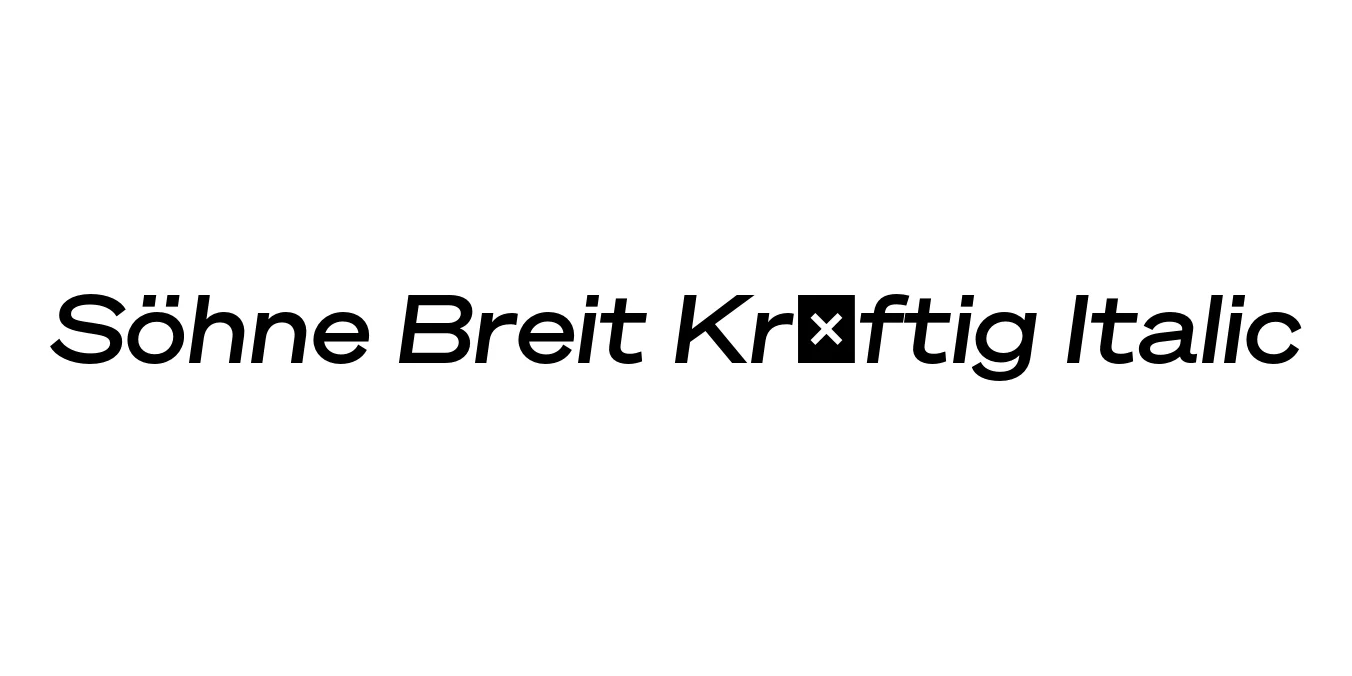
| Font Name | Test Söhne Breit Kräftig |
| Style | Italic |
| Category | Sans-Serif |
| Designer | Kris Sowersby |
| Copyright | Copyright 2023, Kris Sowersby, Klim Type Foundry. |
| License | Free for Personal Use |
| Total Character | 68 |
| Recommended Line Height | 1.33 |
| Ascent | 1037 |
| Descent | 289 |
| Units Per em | 1000 |
| Total Vertical Range | 1326 |
| Max Advance Width | 1408 |
| Max Advance Height | N/A |
| Underline Position | -40 |
| Similar Fonts | Akzidenz-Grotesk, Helvetica, Univers, Unica77 |
Söhne Breit Kräftig Italic Font Details : Font Free Download
Söhne Breit Kräftig Italic is a distinguished member of the Söhne collection by Klim Type Foundry. This specific variant captures the 'Breit' (wide) proportions, offering an expansive and cinematic horizontal presence. The name 'Kräftig' translates to 'strong' or 'powerful,' representing a medium-heavy weight that balances visibility with elegance. It serves as a modern homage to the legendary Akzidenz-Grotesk, specifically distilled through the lens of the New York City subway signage system designed by Unimark.
The Italic styling is not merely a slanted version of the upright but is a carefully crafted companion that maintains the structural integrity of the wide sans-serif form. Developed by Kris Sowersby, this typeface is celebrated for its precise engineering and its ability to feel both historical and contemporary. It is widely used in high-end editorial projects and corporate identities that require a sense of permanence and authority without sacrificing modern flair.
Söhne Breit Kräftig Italic Best Uses
Massive, wide-set headers that need a powerful visual impact.
Pull quotes and emphasized text in high-fashion or architectural magazines.
Tech and luxury brand identities seeking a sturdy yet expansive typographic voice.
Hero sections where a bold, horizontal typeface can anchor the layout.
Söhne Breit Kräftig Italic Glyphs

Download Font
Package Size: Unknown
Available Formats: .OTF