Söhne Breit Kräftig Regular
Designed by Kris Sowersby
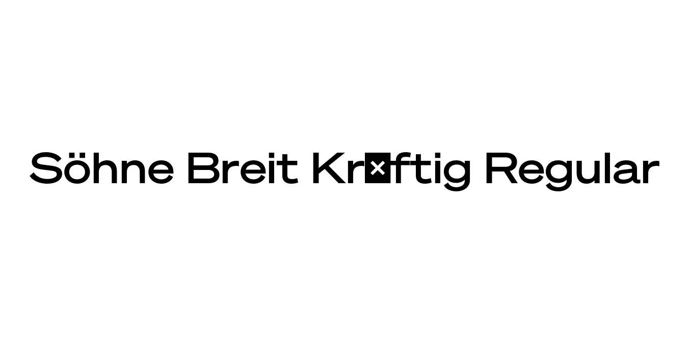
| Font Name | Test Söhne Breit Kräftig |
| Style | Regular |
| Category | Sans Serif |
| Designer | Kris Sowersby |
| Copyright | Copyright 2023, Kris Sowersby, Klim Type Foundry. |
| License | Demo / Paid License |
| Total Character | 68 |
| Recommended Line Height | 1.33 |
| Ascent | 1037 |
| Descent | 289 |
| Units Per em | 1000 |
| Total Vertical Range | 1326 |
| Max Advance Width | 1408 |
| Max Advance Height | N/A |
| Underline Position | -40 |
| Similar Fonts | Akzidenz-Grotesk, Helvetica, Neue Haas Grotesk, San Francisco |
Söhne Breit Kräftig Regular Font Details : Font Free Download
Söhne Breit Kräftig Regular is a distinguished member of the Söhne family, designed by the renowned Kris Sowersby of Klim Type Foundry. This typeface captures the essence of the 'standard' sans serif, specifically drawing inspiration from the legendary Akzidenz-Grotesk while refining its nuances for contemporary digital and print environments.
The Breit (Wide) variant offers a more expansive horizontal presence, making it ideal for impactful headlines and sophisticated layout designs. Its Kräftig weight provides a robust, medium-bold feel that ensures legibility and strength without being overly heavy, perfectly balancing modernist roots with modern technical precision.
Söhne Breit Kräftig Regular Best Uses
Perfect for bold, wide-set headings that demand attention.
Ideal for creating a strong, stable identity for modern corporations.
Excellent for magazine spreads and layout designs requiring a modernist touch.
Suitable for high-end web interfaces where clarity and width are prioritized.
Söhne Breit Kräftig Regular Glyphs

Download Font
Package Size: Unknown
Available Formats: .OTF