Söhne Breit Leicht Regular
Designed by Kris Sowersby
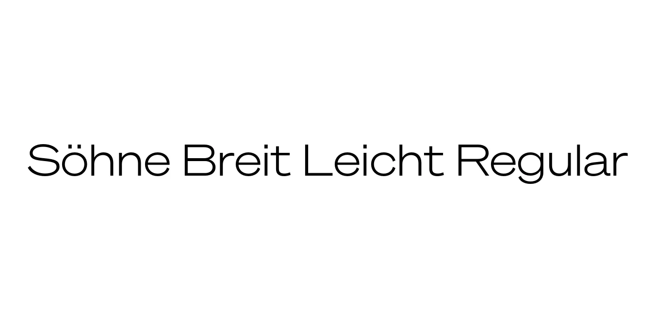
| Font Name | Test Söhne Breit Leicht |
| Style | Regular |
| Category | Sans Serif |
| Designer | Kris Sowersby |
| Copyright | Copyright 2023, Kris Sowersby, Klim Type Foundry. |
| License | Commercial License |
| Total Character | 68 |
| Recommended Line Height | 1.33 |
| Ascent | 1037 |
| Descent | 289 |
| Units Per em | 1000 |
| Total Vertical Range | 1326 |
| Max Advance Width | 1378 |
| Max Advance Height | N/A |
| Underline Position | -105 |
| Similar Fonts | Akzidenz-Grotesk, Helvetica, Univers, Unica77 |
Söhne Breit Leicht Regular Font Details : Font Free Download
Söhne Breit Leicht Regular is a sophisticated expansion of the Söhne collection by Kris Sowersby of the Klim Type Foundry. Drawing inspiration from the legendary Akzidenz-Grotesk, this typeface captures the essence of standard signage found in the New York City subway system, specifically the work of Unimark and Massimo Vignelli. It bridges the gap between mid-century Swiss modernism and contemporary digital precision, offering a "Breit" (wide) stance that provides a generous horizontal rhythm.
The Leicht (Light) weight of the Breit sub-family excels in high-end editorial and architectural contexts. Its wider proportions allow for a breathable, open feel that maintains clarity even in dense layouts. Designed with a focus on neutrality and functionality, Söhne Breit Leicht is ideal for designers seeking a typeface that feels both timeless and engineered, making it a staple for brand identities that value clarity and structural integrity.
Söhne Breit Leicht Regular Best Uses
Excellent for headers and subheaders in minimalist magazines.
Provides a distinct, authoritative look for modern corporate logos.
High impact for large-scale landing page typography.
Clear legibility for signage and environmental graphics.
Söhne Breit Leicht Regular Glyphs

Download Font
Package Size: Unknown
Available Formats: .OTF