Söhne Breit Regular
Designed by Kris Sowersby
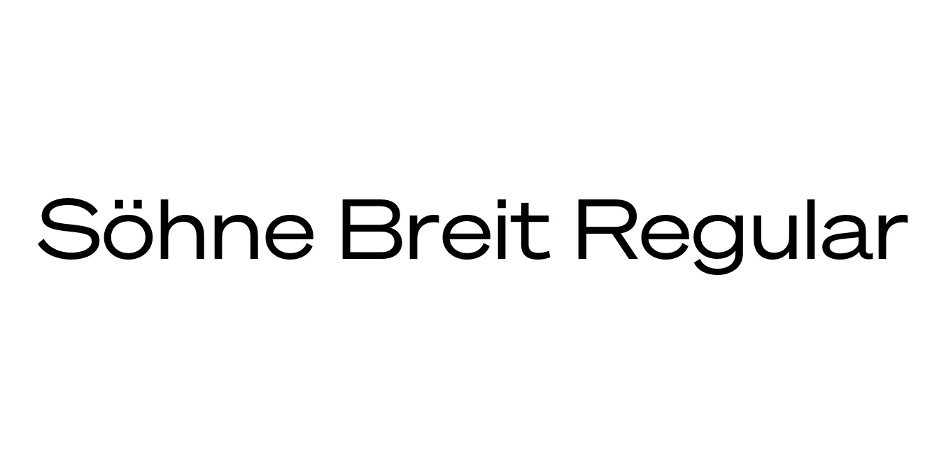
| Font Name | Test Söhne Breit |
| Style | Regular |
| Category | Sans Serif |
| Designer | Kris Sowersby |
| Copyright | Copyright 2023, Kris Sowersby, Klim Type Foundry. |
| License | Free for Personal Use |
| Total Character | 68 |
| Recommended Line Height | 1.33 |
| Ascent | 1037 |
| Descent | 289 |
| Units Per em | 1000 |
| Total Vertical Range | 1326 |
| Max Advance Width | 1386 |
| Max Advance Height | N/A |
| Underline Position | -77 |
| Similar Fonts | Akzidenz-Grotesk, Founders Grotesk, Helvetica, Univers |
Söhne Breit Regular Font Details : Font Free Download
Söhne Breit Regular is a key component of the Söhne collection, meticulously crafted by Kris Sowersby of the Klim Type Foundry. This typeface family serves as an homage to the "memory" of Akzidenz-Grotesk, distilling the essence of the legendary sans-serif into a modern, high-performance tool. The "Breit" variant specifically explores expanded widths, offering a more horizontal and stable typographic rhythm that brings a sense of architectural permanence to any layout.
The design of Söhne Breit Regular is defined by its rational construction, horizontal terminals, and precise optical adjustments. It bridges the gap between mid-century Swiss modernism and contemporary digital requirements. Because of its wide stance and generous proportions, it is exceptionally well-suited for high-end editorial design, luxury branding, and sophisticated environmental graphics where readability and aesthetic authority are paramount.
Söhne Breit Regular Best Uses
Perfect for bold, wide titles that need a modern, architectural feel.
Ideal for logo marks and corporate identities seeking stability and authority.
The wide proportions make it excellent for high-impact visual communication.
Adds a sophisticated and contemporary look to hero sections.
Söhne Breit Regular Glyphs

Download Font
Package Size: Unknown
Available Formats: .OTF