Söhne Extrafett Italic
Designed by Kris Sowersby
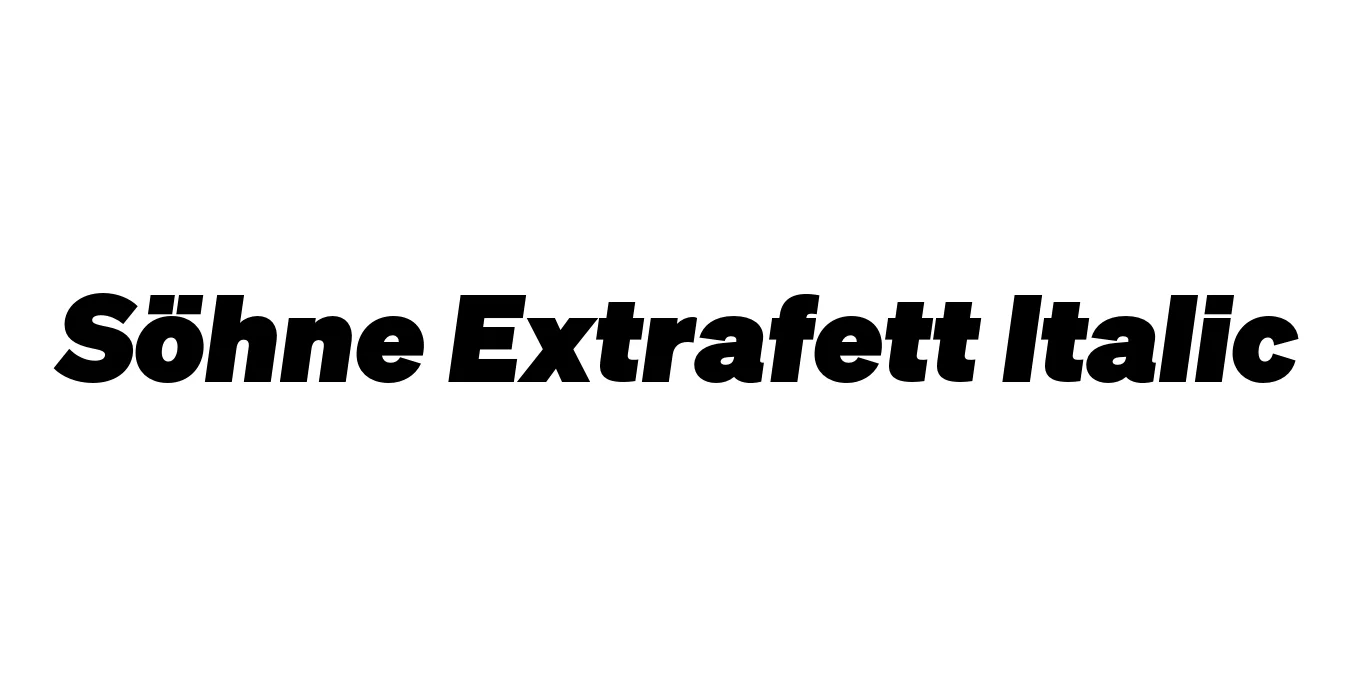
| Font Name | Test Söhne Extrafett |
| Style | Italic |
| Category | Sans Serif |
| Designer | Kris Sowersby |
| Copyright | Copyright 2023, Kris Sowersby, Klim Type Foundry. |
| License | Free for Personal Use |
| Total Character | 68 |
| Recommended Line Height | 1.33 |
| Ascent | 1037 |
| Descent | 289 |
| Units Per em | 1000 |
| Total Vertical Range | 1326 |
| Max Advance Width | 1052 |
| Max Advance Height | N/A |
| Underline Position | 20 |
| Similar Fonts | Akzidenz-Grotesk, Helvetica, Univers, San Francisco |
Söhne Extrafett Italic Font Details : Font Free Download
Söhne Extrafett Italic is a masterpiece of modern typography designed by Kris Sowersby of the Klim Type Foundry. It represents the ultimate expression of the Neo-Grotesk genre, drawing heavy inspiration from the legendary Akzidenz-Grotesk and its use in the iconic New York City subway signage. The 'Extrafett' weight is the heaviest in the family, offering a massive, industrial presence while the Italic slant adds a sense of dynamic movement and modernist urgency to the composition.
Released as part of the broader Söhne collection, this typeface captures the 'Standard' sans-serif aesthetic while refining it for contemporary high-resolution screens and luxury print applications. Its design is characterized by tight apertures, high-contrast joints, and a Swiss-style discipline that makes it an essential tool for designers looking for a font that feels both timeless and aggressively modern.
Söhne Extrafett Italic Best Uses
Perfect for massive, attention-grabbing titles in digital and print magazines.
Excellent for creating powerful, minimalist brand identities with a strong presence.
Highly effective for bold typographic layouts that require a sense of urgency.
Ideal for landing pages that need a high-impact, premium typographic voice.
Söhne Extrafett Italic Glyphs

Download Font
Package Size: Unknown
Available Formats: .OTF