Söhne Extraleicht Regular
Designed by Kris Sowersby
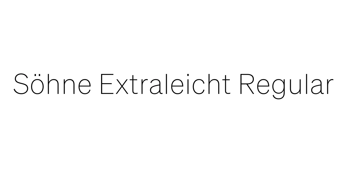
| Font Name | Test Söhne Extraleicht |
| Style | Regular |
| Category | Sans-serif |
| Designer | Kris Sowersby |
| Copyright | Copyright 2023, Kris Sowersby, Klim Type Foundry. |
| License | Free for Personal Use / Demo |
| Total Character | 68 |
| Recommended Line Height | 1.33 |
| Ascent | 1037 |
| Descent | 289 |
| Units Per em | 1000 |
| Total Vertical Range | 1326 |
| Max Advance Width | 1062 |
| Max Advance Height | N/A |
| Underline Position | -140 |
| Similar Fonts | Akzidenz-Grotesk, Helvetica, San Francisco, Inter |
Söhne Extraleicht Regular Font Details : Font Free Download
Söhne Extraleicht Regular is a sophisticated sans-serif typeface designed by Kris Sowersby of the Klim Type Foundry. It serves as a modern homage to the legendary Akzidenz-Grotesk, specifically capturing the materiality and utilitarian spirit of the New York City Subway signage. The typeface bridges the gap between mid-century Swiss modernism and contemporary digital requirements, offering a neutral yet characterful aesthetic that adapts beautifully to various typographic environments.
The Extraleicht (extra light) weight is characterized by its thin, elegant strokes that maintain exceptional clarity and structural integrity. As part of a larger, meticulously crafted family, this weight provides designers with a delicate tool for high-end editorial layouts, minimalist branding, and refined digital interfaces. It represents a masterclass in typographic balance, combining historical weight with modern precision to deliver a versatile and timeless look.
Söhne Extraleicht Regular Best Uses
Perfect for high-end magazine layouts and digital publications that require a refined touch.
Ideal for luxury and lifestyle brands seeking a sophisticated, understated visual identity.
Excellent for clean headings and light UI elements in modern web applications.
Söhne Extraleicht Regular Glyphs

Download Font
Package Size: Unknown
Available Formats: .OTF