Söhne Fett Italic
Designed by Kris Sowersby
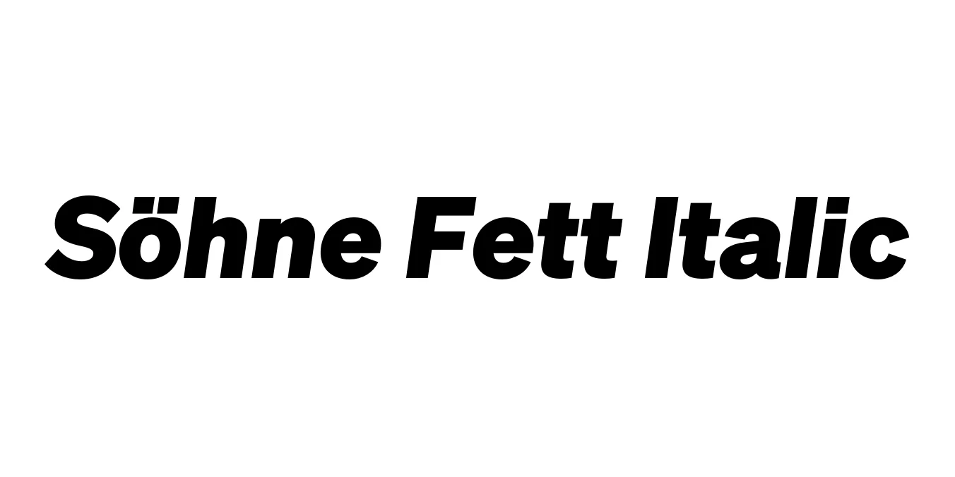
| Font Name | Test Söhne Fett |
| Style | Italic |
| Category | Sans Serif |
| Designer | Kris Sowersby |
| Copyright | Copyright 2023, Kris Sowersby, Klim Type Foundry. |
| License | Commercial (Paid License Required) |
| Total Character | 68 |
| Recommended Line Height | 1.33 |
| Ascent | 1037 |
| Descent | 289 |
| Units Per em | 1000 |
| Total Vertical Range | 1326 |
| Max Advance Width | 1049 |
| Max Advance Height | N/A |
| Underline Position | 0 |
| Similar Fonts | Akzidenz-Grotesk, Helvetica, Unica77, Inter, San Francisco |
Söhne Fett Italic Font Details : Font Free Download
Söhne Fett Italic is a distinguished typeface designed by Kris Sowersby and released through the Klim Type Foundry. It serves as an interpretation of the legendary Akzidenz-Grotesk, specifically capturing the 'memory' of the New York City Subway signage system as refined by Massimo Vignelli and Bob Noorda. The design balances the raw, industrial power of early 20th-century grotesques with contemporary precision, making it a staple for modern Swiss-style typography.
The term 'Fett' translates to 'Bold' in German, and this italic variant provides a dynamic, slanted companion to the heavy upright weight. It is engineered to maintain exceptional clarity and structural integrity even at high speeds of reading. As part of the larger Söhne family, the Fett Italic weight is often selected by designers who require a sophisticated, authoritative voice that bridges the gap between mid-century modernism and 21st-century digital utility.
Söhne Fett Italic Best Uses
Ideal for impactful pull quotes and emphatic subheadings in high-end magazines.
Provides a strong, reliable identity for corporate logos and modern startups.
Excellent for large-scale displays and outdoor signage where bold messaging is required.
Highly effective for clean, minimalist user interfaces and hero sections.
Söhne Fett Italic Glyphs

Download Font
Package Size: Unknown
Available Formats: .OTF