Söhne Fett Regular
Designed by Kris Sowersby
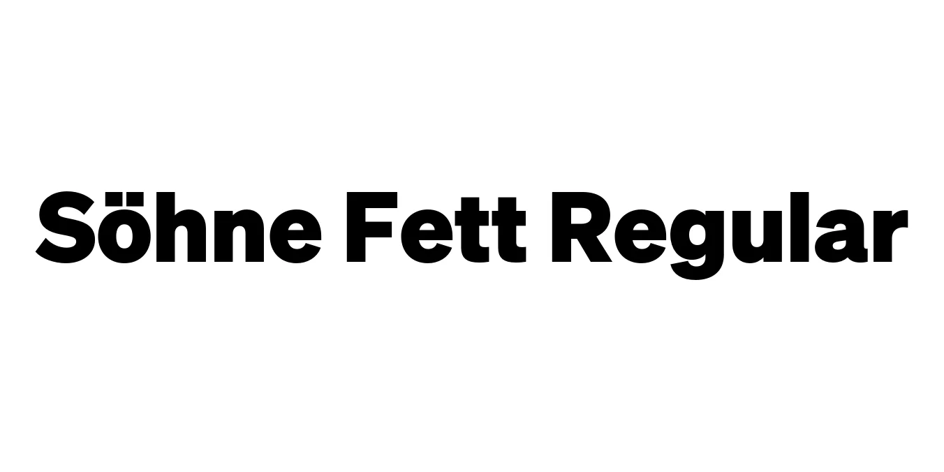
| Font Name | Test Söhne Fett |
| Style | Regular |
| Category | Sans Serif |
| Designer | Kris Sowersby |
| Copyright | Copyright 2023, Kris Sowersby, Klim Type Foundry. |
| License | Free for Personal Use (Demo) |
| Total Character | 68 |
| Recommended Line Height | 1.33 |
| Ascent | 1037 |
| Descent | 289 |
| Units Per em | 1000 |
| Total Vertical Range | 1326 |
| Max Advance Width | 1043 |
| Max Advance Height | N/A |
| Underline Position | 0 |
| Similar Fonts | Akzidenz-Grotesk, Helvetica, San Francisco, Inter |
Söhne Fett Regular Font Details : Font Free Download
Söhne Fett is a standout weight within the Söhne collection, a typeface family that serves as a memory of Akzidenz-Grotesk. Designed by Kris Sowersby of the Klim Type Foundry, it captures the raw, industrial spirit of the original Swiss neo-grotesks while refining the details for modern digital and physical environments. The 'Fett' (bold) weight specifically provides a powerful, authoritative presence that remains surprisingly warm and legible compared to its more clinical predecessors.
The typeface is celebrated for its precise engineering and its ability to bridge the gap between 20th-century history and 21st-century utility. It avoids the over-processed feel of many contemporary sans-serifs, retaining the idiosyncratic charm of early sans-serif metal type. As a result, Söhne Fett Regular has become a go-to choice for high-end fashion brands, technology companies, and editorial designers who require a font that communicates both heritage and innovation.
Söhne Fett Regular Best Uses
Creating impactful visual identities for modern companies.
Perfect for high-impact headlines and pull quotes in magazines.
Ensuring readability and a clean aesthetic on high-resolution screens.
Grabbing attention with bold, clear messaging in print and digital media.
Söhne Fett Regular Glyphs

Download Font
Package Size: Unknown
Available Formats: .OTF