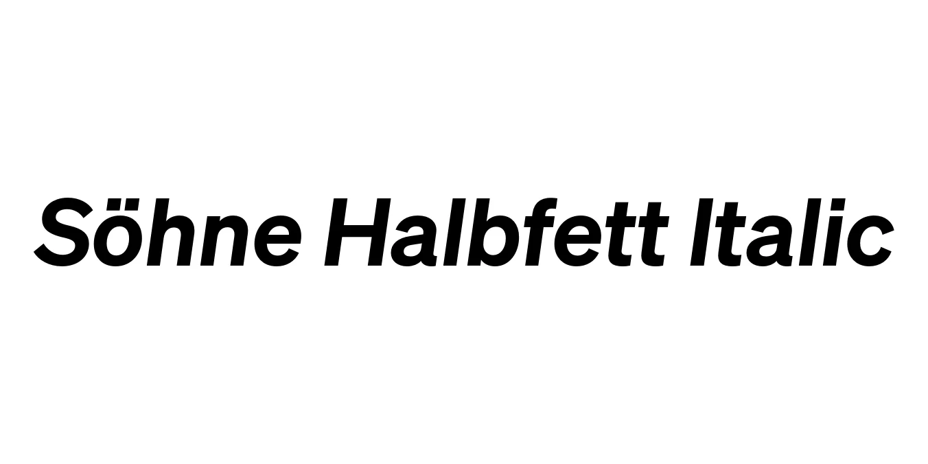
Söhne Halbfett Italic
Designed by Kris Sowersby
| Font Name | Test Söhne Halbfett |
| Style | Italic |
| Category | Sans Serif |
| Designer | Kris Sowersby |
| Copyright | Copyright 2023, Kris Sowersby, Klim Type Foundry. |
| License | Commercial License Required / Demo available |
| Total Character | 68 |
| Recommended Line Height | 1.33 |
| Ascent | 1037 |
| Descent | 289 |
| Units Per em | 1000 |
| Total Vertical Range | 1326 |
| Max Advance Width | 1045 |
| Max Advance Height | N/A |
| Underline Position | -28 |
| Similar Fonts | Akzidenz-Grotesk, Helvetica, Inter, Unica77 |
Söhne Halbfett Italic Font Details : Font Free Download
Söhne Halbfett Italic is a cornerstone weight of the Söhne collection, designed by Kris Sowersby of the Klim Type Foundry. It serves as a modern homage to the legacy of Akzidenz-Grotesk, capturing the industrial, "standard" spirit of the 20th century while being meticulously engineered for contemporary digital and print environments. The 'Halbfett' (semi-bold) weight provides a robust presence, while the italic slant adds a layer of sophisticated motion and emphasis.
Released as part of a larger family that explores the concept of the "memory of Akzidenz-Grotesk," this typeface features refined apertures and terminals that ensure high legibility. Söhne Halbfett Italic is particularly effective when used to create typographic hierarchy, offering a weight that is authoritative without being overwhelming. Its Swiss-inspired roots make it a versatile choice for designers seeking a neutral yet characterful sans-serif that adapts to both display and text settings.
Söhne Halbfett Italic Best Uses
Used for pull quotes and subheaders to create strong visual distinction.
Ideal for professional branding that requires a clean, authoritative aesthetic.
Excellent for highlighted interface elements and buttons needing extra emphasis.
Works beautifully in large-scale typography for a bold, modernist look.
Söhne Halbfett Italic Glyphs

Download Font
Package Size: Unknown
Available Formats: .OTF