Söhne Italic
Designed by Kris Sowersby
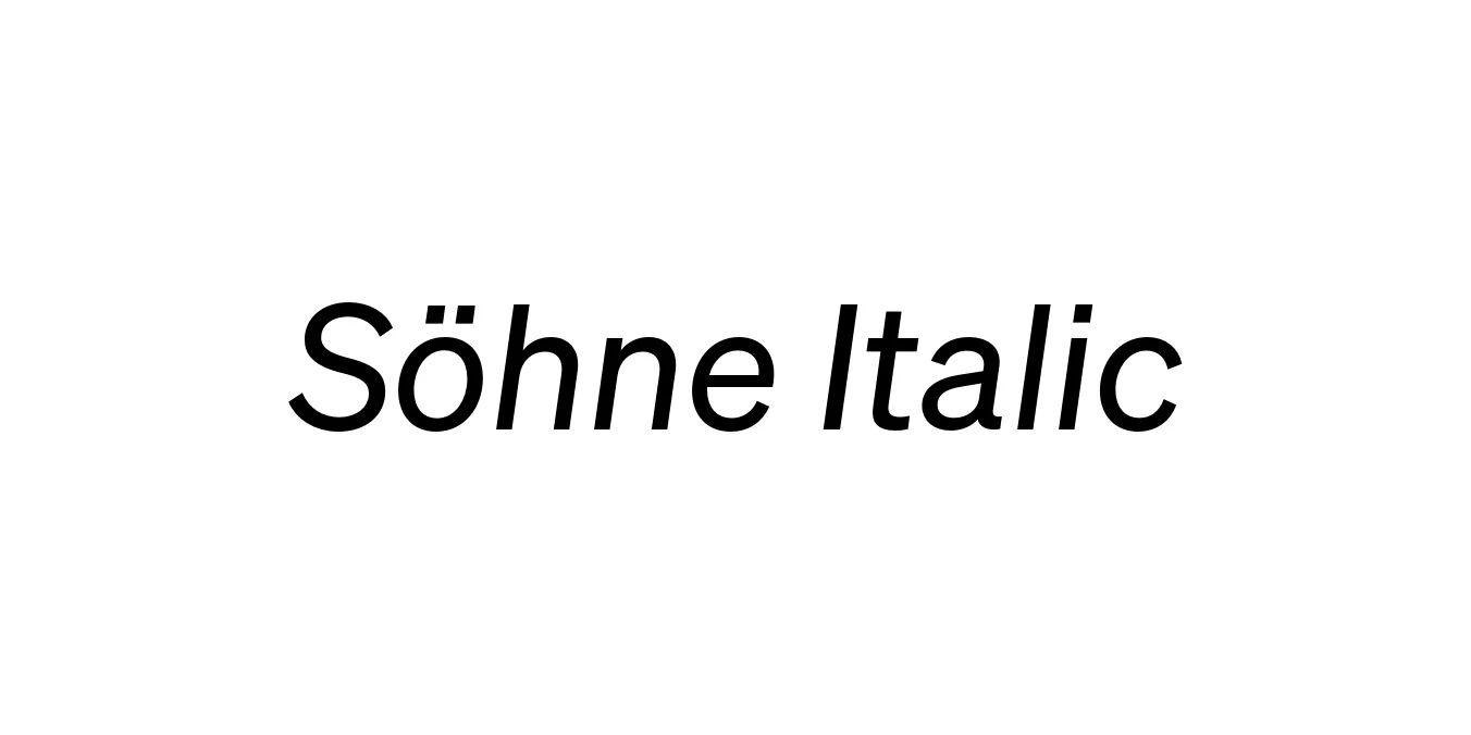
| Font Name | Test Söhne |
| Style | Italic |
| Category | Sans Serif |
| Designer | Kris Sowersby |
| Copyright | Copyright 2023, Kris Sowersby, Klim Type Foundry. |
| License | Free for Personal Use / Demo |
| Total Character | 68 |
| Recommended Line Height | 1.33 |
| Ascent | 1037 |
| Descent | 289 |
| Units Per em | 1000 |
| Total Vertical Range | 1326 |
| Max Advance Width | 1051 |
| Max Advance Height | N/A |
| Underline Position | -77 |
| Similar Fonts | Akzidenz-Grotesk, Helvetica, Unica77, Univers |
Söhne Italic Font Details : Font Free Download
Söhne Italic is a masterfully crafted neo-grotesk typeface designed by Kris Sowersby and released through the Klim Type Foundry in 2019. It represents a refined 'memory' of Akzidenz-Grotesk, distilled through the lens of modern digital precision. The italic weights are particularly notable for their rhythmic slant, which avoids the common pitfalls of mechanical distortion, instead offering a sophisticated flow that complements the industrial rigor of the upright styles.
Drawing significant inspiration from the New York City Subway system and the legendary design work of Massimo Vignelli, Söhne Italic captures the raw, functional beauty of mid-century modernism. It is widely utilized in high-end editorial projects and corporate branding where a balance of neutrality and distinct character is required. Its timeless aesthetic ensures it remains a staple for designers looking for a typeface that is both historic in roots and contemporary in execution.
Söhne Italic Best Uses
Ideal for creating a sophisticated and timeless corporate identity.
Perfect for magazines, pull quotes, and dynamic subheadings.
Highly legible for clean and functional digital interfaces.
Effective for clear wayfinding and environmental graphics.
Söhne Italic Glyphs

Download Font
Package Size: Unknown
Available Formats: .OTF