Söhne Kräftig Regular
Designed by Kris Sowersby
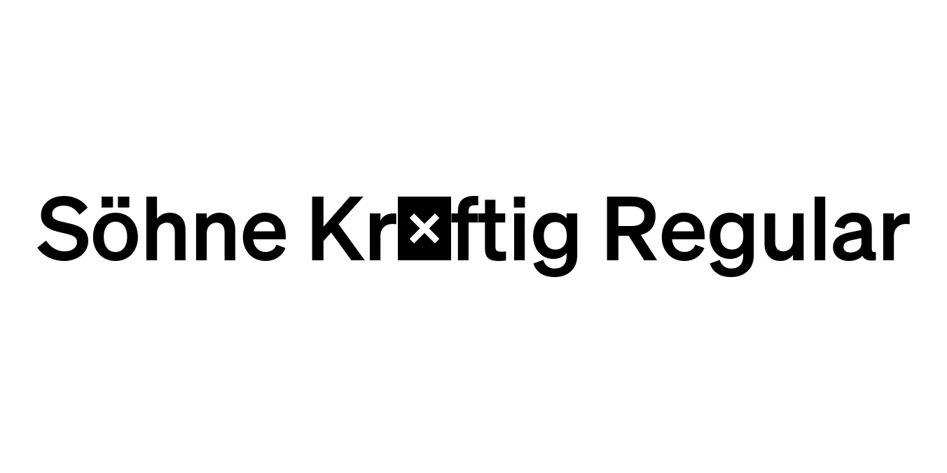
| Font Name | Test Söhne Kräftig |
| Style | Regular |
| Category | Sans Serif |
| Designer | Kris Sowersby |
| Copyright | Copyright 2023, Kris Sowersby, Klim Type Foundry. |
| License | Free for Personal Use |
| Total Character | 68 |
| Recommended Line Height | 1.33 |
| Ascent | 1037 |
| Descent | 289 |
| Units Per em | 1000 |
| Total Vertical Range | 1326 |
| Max Advance Width | 1035 |
| Max Advance Height | N/A |
| Underline Position | -40 |
| Similar Fonts | Akzidenz-Grotesk, Helvetica, Inter, San Francisco |
Söhne Kräftig Regular Font Details : Font Free Download
Söhne Kräftig Regular is a masterful neo-grotesque typeface designed by Kris Sowersby and released through the Klim Type Foundry. It is conceived as the memory of Akzidenz-Grotesk, capturing the spirit and utilitarian nature of the legendary 19th-century typeface while refining it for modern digital environments. The name 'Söhne' is German for 'sons,' symbolizing its lineage as a direct descendant of the foundational grotesque style that paved the way for modern typography.
The Kräftig weight (which translates to 'strong' or 'powerful') provides a robust and authoritative presence on the page without sacrificing the neutral elegance the family is known for. This specific variant is meticulously balanced, featuring precise optical corrections and a sophisticated terminal structure that ensures maximum legibility in both display and text applications. It stands as a pinnacle of contemporary Swiss-style design, offering a timeless aesthetic for high-end graphic design.
Söhne Kräftig Regular Best Uses
Ideal for creating strong, neutral, and professional brand identities.
Perfect for high-impact headlines and sub-headers in magazines.
Excellent for navigational elements and interface typography where clarity is key.
High legibility makes it suitable for environmental graphics and wayfinding.
Söhne Kräftig Regular Glyphs

Download Font
Package Size: Unknown
Available Formats: .OTF