Söhne Leicht Italic
Designed by Kris Sowersby
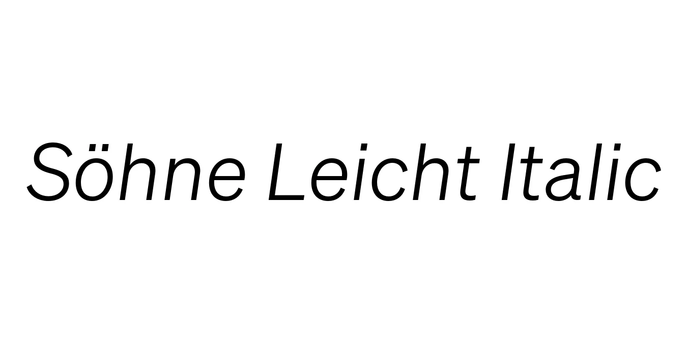
| Font Name | Test Söhne Leicht |
| Style | Italic |
| Category | Sans-Serif |
| Designer | Kris Sowersby |
| Copyright | Copyright 2023, Kris Sowersby, Klim Type Foundry. |
| License | Commercial License Required (Demo version available) |
| Total Character | 68 |
| Recommended Line Height | 1.33 |
| Ascent | 1037 |
| Descent | 289 |
| Units Per em | 1000 |
| Total Vertical Range | 1326 |
| Max Advance Width | 1056 |
| Max Advance Height | N/A |
| Underline Position | -105 |
| Similar Fonts | Akzidenz-Grotesk, Helvetica, Inter, San Francisco |
Söhne Leicht Italic Font Details : Font Free Download
Söhne Leicht Italic is a distinguished typeface designed by Kris Sowersby and released through the Klim Type Foundry. It is conceptualized as the 'memory' of Akzidenz-Grotesk, meticulously adapted for the digital age. This font captures the essence of the legendary typeface used for the New York City Subway sign system, blending historical industrial roots with a refined, contemporary precision that ensures clarity across various screen resolutions and print media.
The Leicht Italic weight offers a slender, elegant profile with a rhythmic slant that provides a sophisticated contrast to its upright counterparts. It is characterized by its clean lines and rationalist Swiss-style construction, making it an exceptional choice for designers seeking a professional, high-end aesthetic. Whether used for subtle emphasis or as a primary stylistic element, it maintains an air of understated luxury and modern functionalism.
Söhne Leicht Italic Best Uses
Perfect for sophisticated pull quotes, captions, and body text emphasis in magazines.
Ideal for minimalist luxury brand identities and premium corporate typography.
Great for clean UI/UX elements that require a touch of modern elegance.
Söhne Leicht Italic Glyphs

Download Font
Package Size: Unknown
Available Formats: .OTF