Söhne Mono Extrafett Italic
Designed by Kris Sowersby
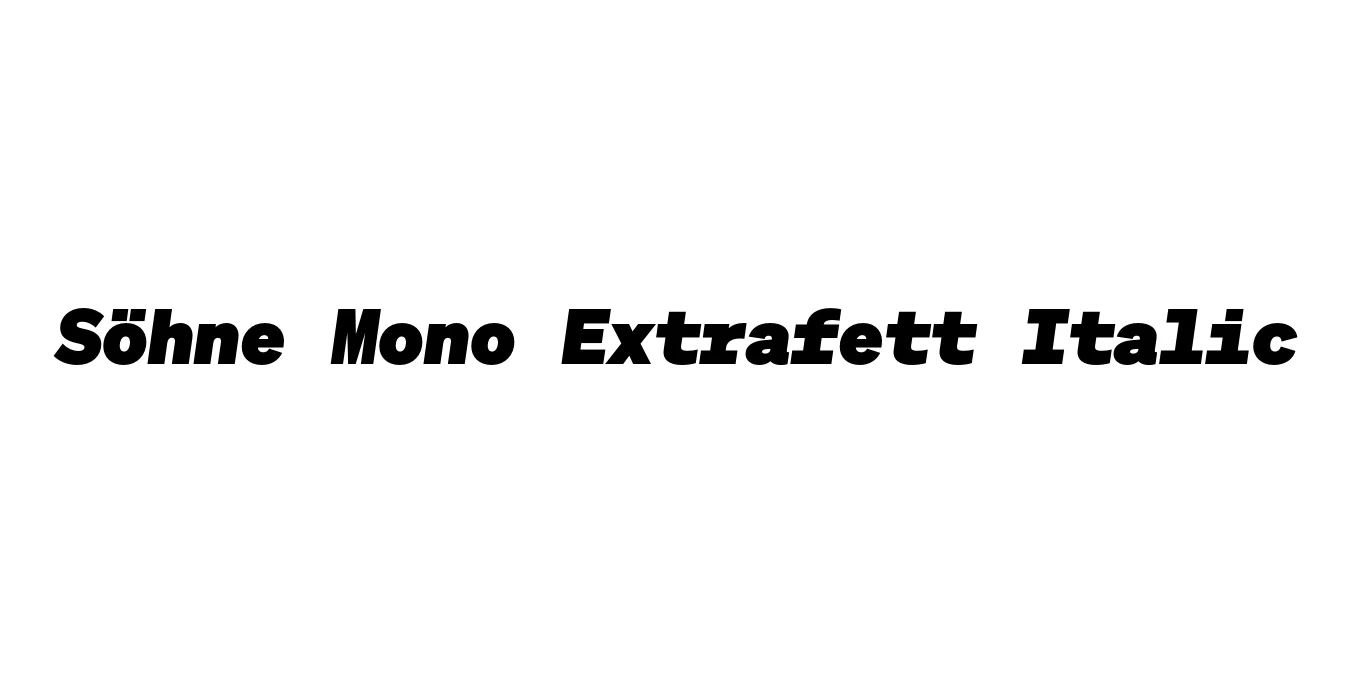
| Font Name | Test Söhne Mono Extrafett |
| Style | Italic |
| Category | Monospaced / Sans Serif |
| Designer | Kris Sowersby |
| Copyright | Copyright 2023, Kris Sowersby, Klim Type Foundry. |
| License | Demo |
| Total Character | 68 |
| Recommended Line Height | 1.33 |
| Ascent | 1037 |
| Descent | 289 |
| Units Per em | 1000 |
| Total Vertical Range | 1326 |
| Max Advance Width | 1200 |
| Max Advance Height | N/A |
| Underline Position | 20 |
| Similar Fonts | Akzidenz-Grotesk Mono, Founders Grotesk Mono, Input Mono, Helvetica Monospaced |
Söhne Mono Extrafett Italic Font Details : Font Free Download
Söhne Mono Extrafett Italic is a distinguished member of the Söhne collection, designed by Kris Sowersby of the Klim Type Foundry. The Söhne family serves as the memory of Akzidenz-Grotesk, capturing the essence of the typeface used in the New York City Subway system designed by Unimark. This specific monospaced variant translates the industrial, no-nonsense aesthetic into a fixed-width format, blending brutalist functionality with contemporary refinement.
The Extrafett Italic weight represents the heaviest italicized version of the monospaced series. It maintains the precise proportions required for digital environments while offering a massive, commanding presence. The italic slant adds a sense of urgency and dynamic energy to the otherwise rigid monospaced structure, making it an exceptional choice for designers looking to balance technical constraints with bold, expressive typography.
Söhne Mono Extrafett Italic Best Uses
Ideal for developers who want a high-impact, brutalist aesthetic in their IDE.
Perfect for pull quotes, bold headlines, and sidebars in modern magazines.
Used in tech-focused visual identities to convey precision and strength.
Works excellently for large-scale typography where the monospaced rhythm creates a unique texture.
Söhne Mono Extrafett Italic Glyphs

Download Font
Package Size: Unknown
Available Formats: .OTF