Söhne Mono Halbfett Italic
Designed by Kris Sowersby
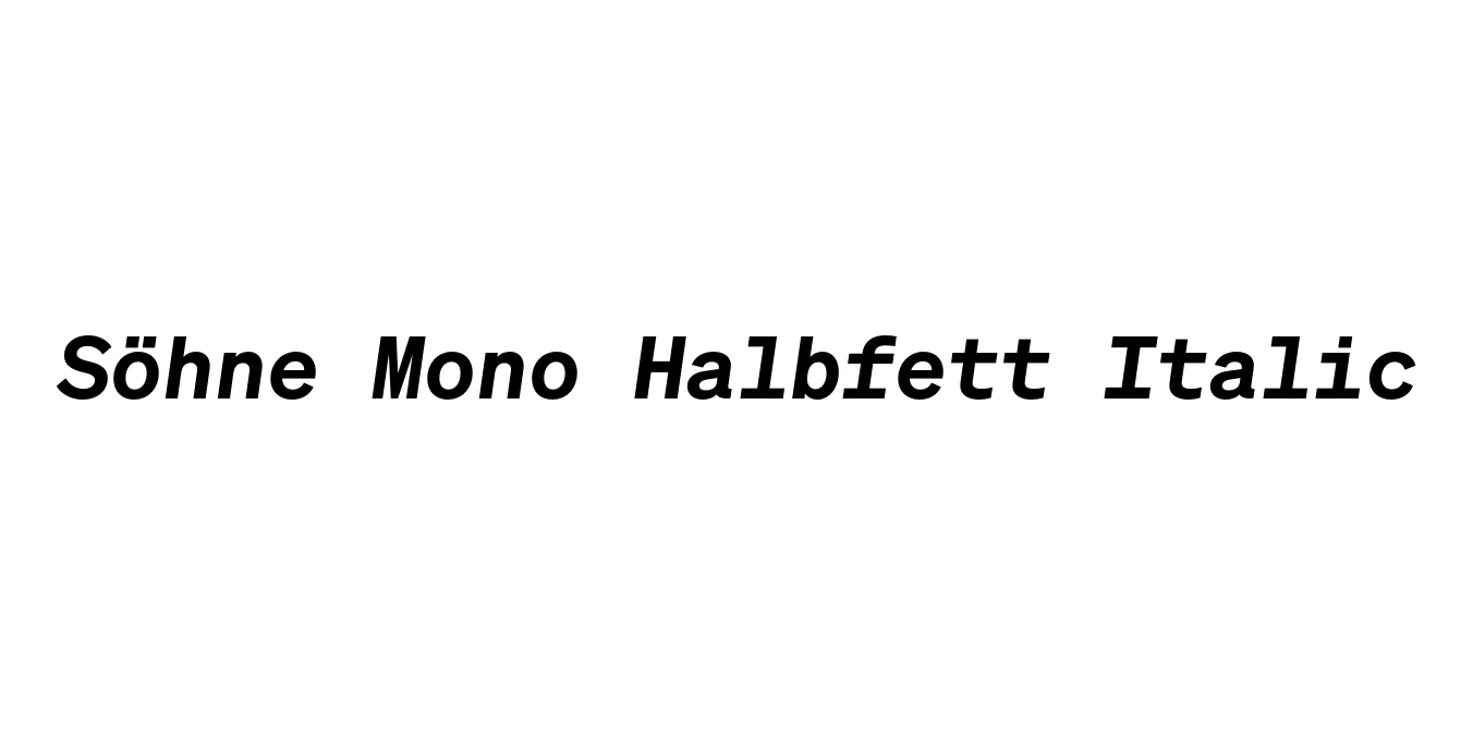
| Font Name | Test Söhne Mono Halbfett |
| Style | Italic |
| Category | Monospaced Sans Serif |
| Designer | Kris Sowersby |
| Copyright | Copyright 2023, Kris Sowersby, Klim Type Foundry. |
| License | Free for Personal Use / Demo |
| Total Character | 68 |
| Recommended Line Height | 1.33 |
| Ascent | 1037 |
| Descent | 289 |
| Units Per em | 1000 |
| Total Vertical Range | 1326 |
| Max Advance Width | 1200 |
| Max Advance Height | N/A |
| Underline Position | -28 |
| Similar Fonts | SF Mono, Roboto Mono, Akzidenz-Grotesk Mono, IBM Plex Mono |
Söhne Mono Halbfett Italic Font Details : Font Free Download
Söhne Mono Halbfett Italic is a distinguished member of the Söhne collection, designed by Kris Sowersby and released through the Klim Type Foundry. It represents the fixed-pitch counterpart to the standard Söhne, capturing the essence of Akzidenz-Grotesk while adapting it to the rigorous constraints of monospaced design. The Halbfett weight provides a robust, semi-bold presence, while the italic slant adds a dynamic, sophisticated touch that maintains legibility across various digital environments.
This typeface is deeply rooted in the history of industrial typography, particularly the iconic signage found in the New York City subway system. By blending the utilitarian aesthetic of mid-century modernism with contemporary precision, Söhne Mono Halbfett Italic serves as a versatile tool for designers who require the structure of a grid-based font without sacrificing the character and warmth of a classical grotesque.
Söhne Mono Halbfett Italic Best Uses
Excellent for code editors and terminal environments where weight distinction helps with syntax highlighting.
Ideal for tech-focused brands looking for a balance between industrial utility and modern elegance.
Perfect for metadata, captions, and technical specifications in print or digital magazines.
Söhne Mono Halbfett Italic Glyphs

Download Font
Package Size: Unknown
Available Formats: .OTF