Söhne Mono Leicht Regular
Designed by Kris Sowersby
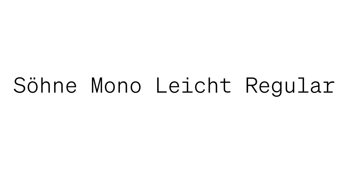
| Font Name | Test Söhne Mono Leicht |
| Style | Regular |
| Category | Monospaced / Sans Serif |
| Designer | Kris Sowersby |
| Copyright | Copyright 2023, Kris Sowersby, Klim Type Foundry. |
| License | Commercial License Required / Demo |
| Total Character | 68 |
| Recommended Line Height | 1.33 |
| Ascent | 1037 |
| Descent | 289 |
| Units Per em | 1000 |
| Total Vertical Range | 1326 |
| Max Advance Width | 1200 |
| Max Advance Height | N/A |
| Underline Position | -105 |
| Similar Fonts | SF Mono, Roboto Mono, Atlas Typewriter, Helvetica Monospaced |
Söhne Mono Leicht Regular Font Details : Font Free Download
Söhne Mono Leicht Regular is a sophisticated monospaced typeface designed by Kris Sowersby of the Klim Type Foundry. It serves as the typewriter-inspired companion to the broader Söhne collection, which captures the foundational spirit of Akzidenz-Grotesk. The 'Leicht' weight offers a delicate and airy appearance, maintaining high legibility while providing a distinctively modern, Swiss-inspired aesthetic that feels both industrial and refined.
The design philosophy behind Söhne Mono centers on the balance between fixed-pitch constraints and the elegance of high-end typography. By stripping away the variable widths of standard sans-serifs, it creates a rhythmic, structured look that is highly sought after in contemporary editorial design and high-tech branding. Its precision makes it a favorite for designers who want to convey a sense of 'raw' technicality without sacrificing the polished finish of a premium font.
Söhne Mono Leicht Regular Best Uses
Provides a clean, distraction-free environment for writing and reading code.
Excellent for sidebars, captions, and data-heavy layouts in magazines.
Ideal for tech startups and architecture firms seeking a precise brand voice.
Perfect for displaying structured data, metadata, or developer documentation.
Söhne Mono Leicht Regular Glyphs

Download Font
Package Size: Unknown
Available Formats: .OTF