Söhne Regular
Designed by Kris Sowersby
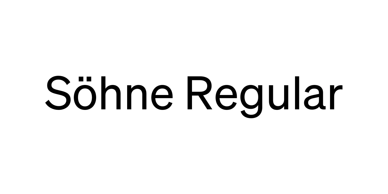
| Font Name | Test Söhne |
| Style | Regular |
| Category | Sans Serif |
| Designer | Kris Sowersby |
| Copyright | Copyright 2023, Kris Sowersby, Klim Type Foundry. |
| License | Commercial License Required / Demo |
| Total Character | 68 |
| Recommended Line Height | 1.33 |
| Ascent | 1037 |
| Descent | 289 |
| Units Per em | 1000 |
| Total Vertical Range | 1326 |
| Max Advance Width | 1045 |
| Max Advance Height | N/A |
| Underline Position | -77 |
| Similar Fonts | Akzidenz-Grotesk, Helvetica, San Francisco, Inter, National 2 |
Söhne Regular Font Details : Font Free Download
Söhne is the memory of Akzidenz-Grotesk adapted for the digital age. It captures the analogue materiality of Standard Medium—the typeface used in the iconic NYC Subway signs—and translates it into a precise, high-performance digital toolset. Released by the Klim Type Foundry, Söhne focuses on the balance between geometric clarity and the idiosyncratic warmth found in early 20th-century Swiss grotesques.
The Söhne Regular weight specifically excels in editorial design and corporate identity systems where a neutral yet authoritative voice is required. It maintains a distinct sharpness at large sizes while remaining remarkably legible in dense blocks of text, making it a favorite for contemporary web and print environments that demand a professional, minimalist aesthetic.
Söhne Regular Best Uses
Perfect for creating timeless visual identities and logos that require a clean, modern look.
Ideal for magazines, high-end books, and long-form digital articles.
Excellent legibility for mobile apps, web dashboards, and complex UI layouts.
Highly effective for signage and environmental graphics due to its clear letterforms.
Söhne Regular Glyphs

Download Font
Package Size: Unknown
Available Formats: .OTF