Söhne Schmal Bold
Designed by Kris Sowersby
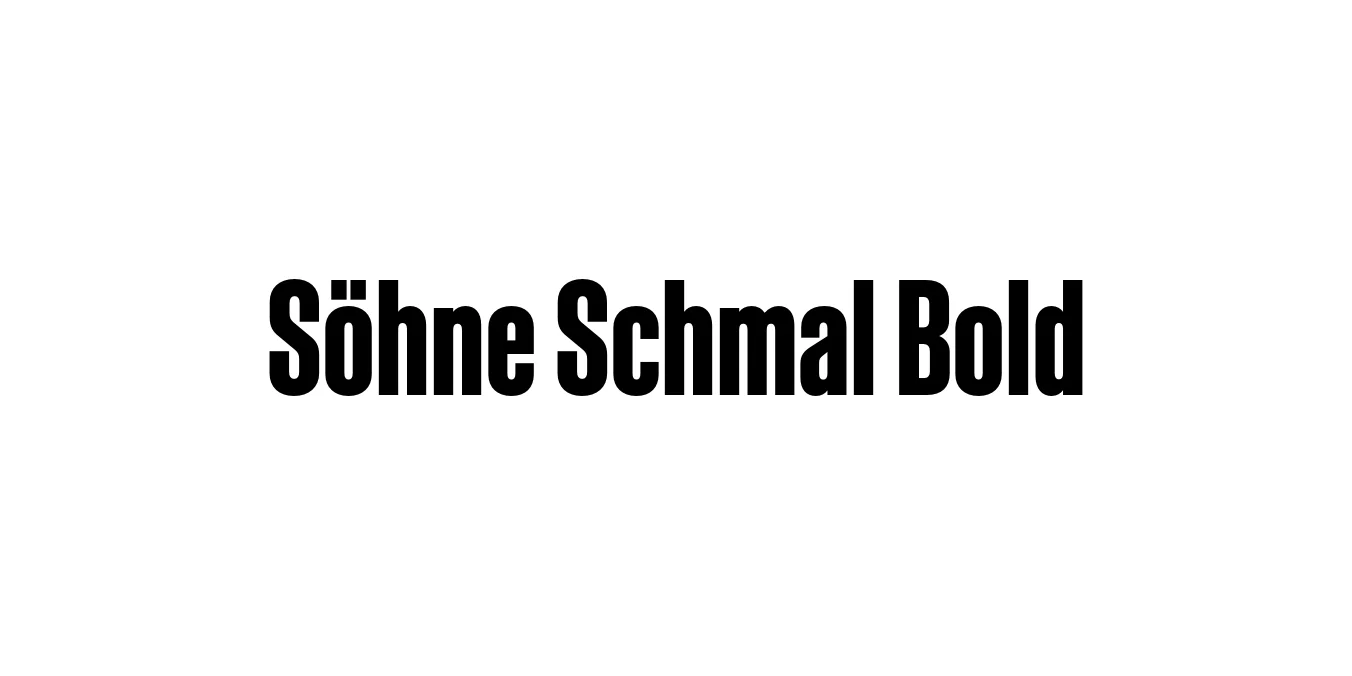
| Font Name | Test Söhne Schmal |
| Style | Bold |
| Category | Sans-Serif |
| Designer | Kris Sowersby |
| Copyright | Copyright 2023, Kris Sowersby, Klim Type Foundry. |
| License | Commercial License Required |
| Total Character | 68 |
| Recommended Line Height | 1.33 |
| Ascent | 1037 |
| Descent | 289 |
| Units Per em | 1000 |
| Total Vertical Range | 1326 |
| Max Advance Width | 600 |
| Max Advance Height | N/A |
| Underline Position | -41 |
| Similar Fonts | Akzidenz-Grotesk Condensed, Helvetica Compressed, Univers 67, National 2 Condensed |
Söhne Schmal Bold Font Details : Font Free Download
Söhne Schmal Bold is a premium condensed typeface designed by Kris Sowersby and released through the Klim Type Foundry. It represents a refined evolution of the classic Akzidenz-Grotesk aesthetic, capturing the "memory" of the iconic typeface while adapting it for the precision of contemporary digital and print design. The 'Schmal' designation refers to its condensed width, making it an ideal choice for compact yet high-impact messaging.
The Bold weight of the Schmal family provides a dense, authoritative texture that excels in tight typographic environments. By balancing historical industrial quirks with modern geometric clarity, Söhne Schmal Bold offers designers a versatile tool for creating strong visual hierarchies. Its tight apertures and sturdy strokes ensure that even at large scales, the font maintains a sophisticated, modernist professional edge.
Söhne Schmal Bold Best Uses
Perfect for magazine headlines and newspaper titling where horizontal space is limited.
Ideal for creating large, impactful typographic posters with a Swiss design influence.
Effective for bold, condensed web headers that need to grab attention quickly.
Excellent for corporate identities that require a sturdy, professional, and compact logotype.
Söhne Schmal Bold Glyphs

Download Font
Package Size: Unknown
Available Formats: .OTF