Söhne Schmal Bold Italic
Designed by Kris Sowersby
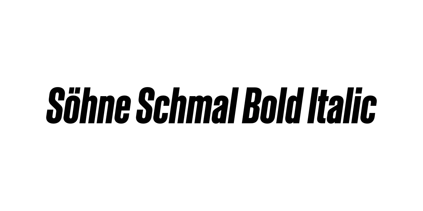
| Font Name | Test Söhne Schmal |
| Style | Bold Italic |
| Category | Sans Serif |
| Designer | Kris Sowersby |
| Copyright | Copyright 2023, Kris Sowersby, Klim Type Foundry. |
| License | Free for Personal Use |
| Total Character | 68 |
| Recommended Line Height | 1.33 |
| Ascent | 1037 |
| Descent | 289 |
| Units Per em | 1000 |
| Total Vertical Range | 1326 |
| Max Advance Width | 701 |
| Max Advance Height | N/A |
| Underline Position | -41 |
| Similar Fonts | Akzidenz-Grotesk, Helvetica Compressed, Univers, National |
Söhne Schmal Bold Italic Font Details : Font Free Download
Söhne Schmal Bold Italic is a masterful execution of the condensed grotesk genre, designed by Kris Sowersby of the Klim Type Foundry. As part of the broader Söhne collection, it represents the 'memory' of Akzidenz-Grotesk, translated into a modern digital system. The Schmal (narrow) width is specifically engineered to handle tight compositions without sacrificing the iconic, industrial rhythm that makes the typeface so versatile.
The Bold Italic weight adds a layer of kinetic energy and structural emphasis to the family. By combining a condensed horizontal footprint with a sharp, rhythmic slant, it provides designers with a tool for high-impact communication. It is frequently utilized in Swiss-style typography layouts where precision, clarity, and a sophisticated aesthetic are paramount for professional branding and editorial projects.
Söhne Schmal Bold Italic Best Uses
High-impact magazine headlines and dynamic pull quotes.
Modern corporate identities requiring a strong, condensed visual presence.
Effective for bold messaging in limited horizontal spaces.
Creating rhythmic, typographic-focused layouts with high contrast.
Söhne Schmal Bold Italic Glyphs

Download Font
Package Size: Unknown
Available Formats: .OTF