Söhne Schmal Extrafett Regular
Designed by Kris Sowersby
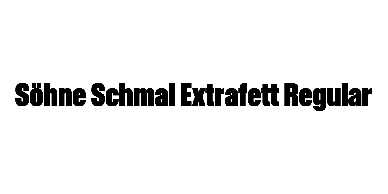
| Font Name | Test Söhne Schmal Extrafett |
| Style | Regular |
| Category | Sans Serif |
| Designer | Kris Sowersby |
| Copyright | Copyright 2023, Kris Sowersby, Klim Type Foundry. |
| License | Demo |
| Total Character | 68 |
| Recommended Line Height | 1.33 |
| Ascent | 1037 |
| Descent | 289 |
| Units Per em | 1000 |
| Total Vertical Range | 1326 |
| Max Advance Width | 670 |
| Max Advance Height | N/A |
| Underline Position | -2 |
| Similar Fonts | Akzidenz-Grotesk, Helvetica Condensed, Univers 67 Bold Condensed |
Söhne Schmal Extrafett Regular Font Details : Font Free Download
Söhne Schmal Extrafett Regular is a masterful evolution of the classic grotesque, acting as a contemporary homage to the legacy of Akzidenz-Grotesk. Designed by Kris Sowersby and released through Klim Type Foundry, this typeface captures the industrial efficiency and raw neutrality of the early 20th-century sans-serifs while optimizing them for high-resolution digital environments. The 'Schmal' designation highlights its narrow, condensed nature, while 'Extrafett' emphasizes its heavy, extra-bold weight.
This specific weight is engineered for maximum visual impact in tight spaces. Its dense letterforms and tight apertures create a rhythmic, authoritative texture that is both modern and timeless. Söhne Schmal Extrafett is frequently chosen by designers who need to balance extreme bold weight with horizontal economy, making it an essential tool for high-end editorial and typographic branding projects.
Söhne Schmal Extrafett Regular Best Uses
Perfect for bold, high-impact titles that require a narrow footprint.
Ideal for large-scale typographic layouts where space optimization is critical.
Used for creating strong, modern, and authoritative corporate visual identities.
Excellent for magazine covers and dense typographic hero sections.
Söhne Schmal Extrafett Regular Glyphs

Download Font
Package Size: Unknown
Available Formats: .OTF