Söhne Schmal Extraleicht Italic
Designed by Kris Sowersby
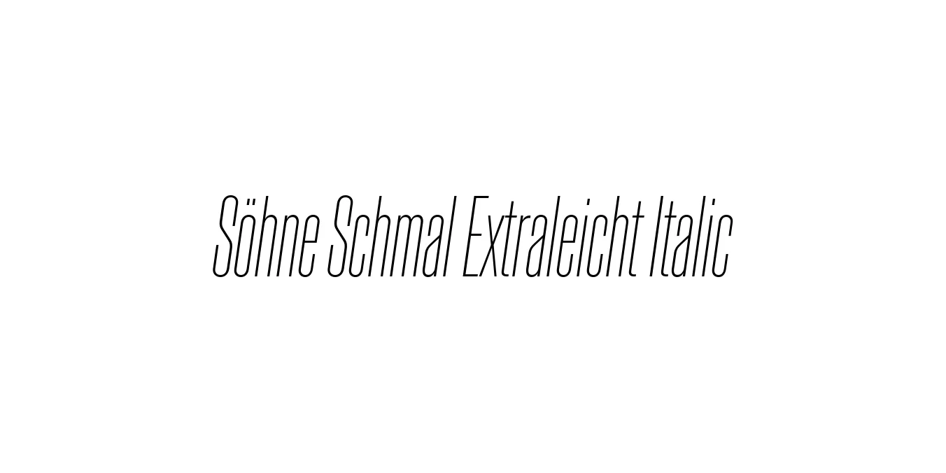
| Font Name | Test Söhne Schmal Extraleicht |
| Style | Italic |
| Category | Sans Serif |
| Designer | Kris Sowersby |
| Copyright | Copyright 2023, Kris Sowersby, Klim Type Foundry. |
| License | Commercial License / Demo |
| Total Character | 68 |
| Recommended Line Height | 1.33 |
| Ascent | 1037 |
| Descent | 289 |
| Units Per em | 1000 |
| Total Vertical Range | 1326 |
| Max Advance Width | 701 |
| Max Advance Height | N/A |
| Underline Position | -62 |
| Similar Fonts | Akzidenz-Grotesk, Helvetica, Univers, Unica77 |
Söhne Schmal Extraleicht Italic Font Details : Font Free Download
Söhne Schmal Extraleicht Italic is a refined expression of the iconic 'Standard' typeface, better known today through its descendants like Akzidenz-Grotesk. Designed by Kris Sowersby of the Klim Type Foundry, the Söhne collection aims to capture the materiality and precision of the New York City Subway’s signage system designed by Massimo Vignelli and Bob Noorda. The Schmal variant introduces a condensed width that maintains clarity and authority even in tight spaces.
This specific weight, Extraleicht Italic, provides a delicate, ethereal quality that contrasts beautifully with the more industrial roots of the typeface. The italicized forms are not merely slanted but are carefully adjusted to preserve the rhythmic flow of the condensed sans-serif design. It represents a bridge between mid-century Swiss modernism and contemporary digital type design, making it an essential tool for high-end editorial and branding projects.
Söhne Schmal Extraleicht Italic Best Uses
Perfect for sophisticated magazine headers and pull quotes.
Ideal for luxury brand identities requiring a slim, elegant silhouette.
Excellent for stylized navigation or delicate hero section subtitles.
Suitable for high-quality posters and architectural documentation.
Söhne Schmal Extraleicht Italic Glyphs

Download Font
Package Size: Unknown
Available Formats: .OTF