Söhne Schmal Fett Italic
Designed by Kris Sowersby
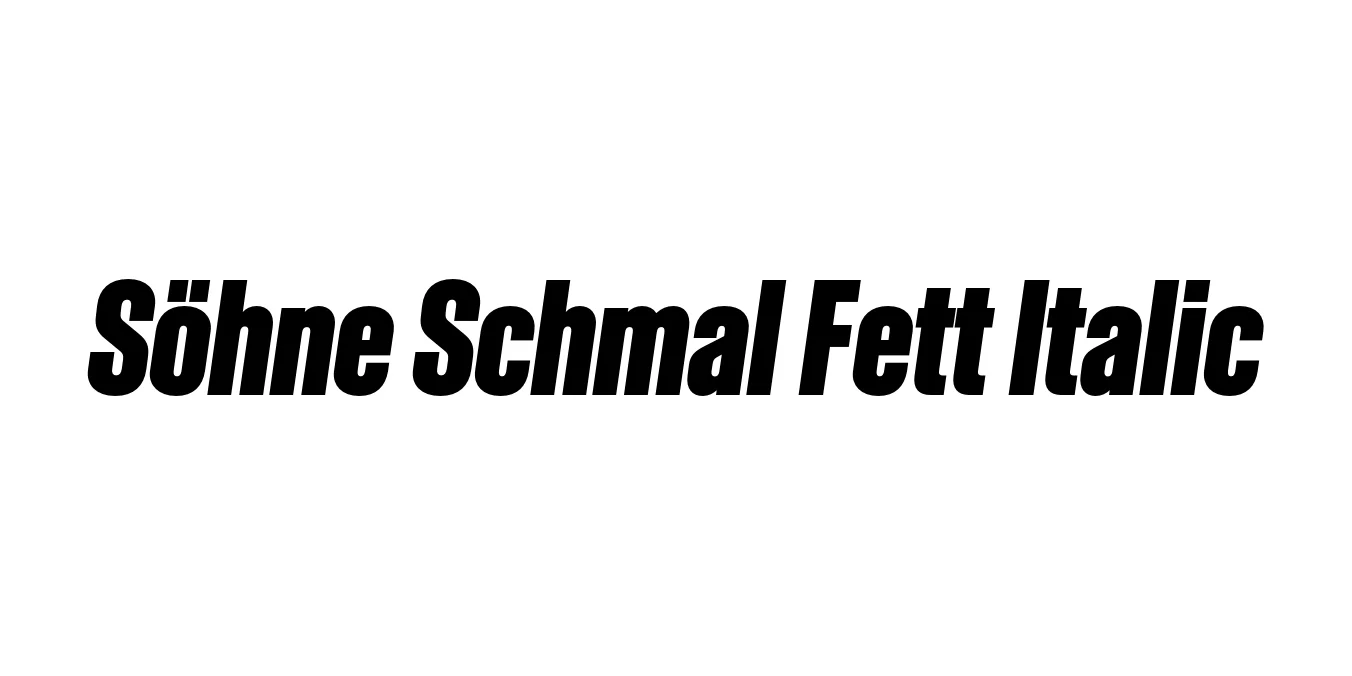
| Font Name | Test Söhne Schmal Fett |
| Style | Italic |
| Category | Sans Serif |
| Designer | Kris Sowersby |
| Copyright | Copyright 2023, Kris Sowersby, Klim Type Foundry. |
| License | Commercial License Required (Check Klim Type Foundry) |
| Total Character | 68 |
| Recommended Line Height | 1.33 |
| Ascent | 1037 |
| Descent | 289 |
| Units Per em | 1000 |
| Total Vertical Range | 1326 |
| Max Advance Width | 701 |
| Max Advance Height | N/A |
| Underline Position | -22 |
| Similar Fonts | Akzidenz-Grotesk, Helvetica, Univers, Unica77 |
Söhne Schmal Fett Italic Font Details : Font Free Download
Söhne Schmal Fett Italic is a specialized weight within the Söhne family, designed by Kris Sowersby of the Klim Type Foundry. It is described as the memory of Akzidenz-Grotesk, capturing the industrial spirit and mechanical precision of mid-century sans-serifs while updating them for modern digital environments. The 'Schmal' designation indicates a condensed width, while 'Fett' denotes its bold, heavy weight, making it a powerhouse for high-impact typography.
This typeface is part of a larger system that explores the 'Standard' or 'Neutral' style of typography that became dominant in the 20th century. The italic version maintains the structural integrity of the condensed bold forms while adding a sense of urgency and motion. It is a favorite among graphic designers for its ability to convey authority and contemporary elegance in complex editorial layouts and high-end branding systems.
Söhne Schmal Fett Italic Best Uses
Perfect for striking headlines and pull-quotes in high-end magazines.
Excellent for bold corporate logos and identity systems needing a narrow profile.
Ideal for hero sections and navigation where space is limited but impact is required.
Great for large-scale posters and digital banners requiring a commanding presence.
Söhne Schmal Fett Italic Glyphs

Download Font
Package Size: Unknown
Available Formats: .OTF