Söhne Schmal Kräftig Italic
Designed by Kris Sowersby
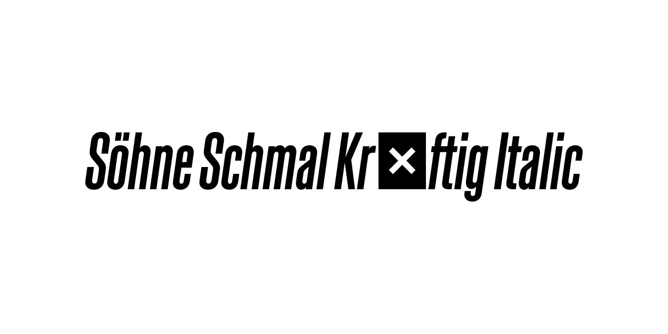
| Font Name | Test Söhne Schmal Kräftig |
| Style | Italic |
| Category | Sans-Serif |
| Designer | Kris Sowersby |
| Copyright | Copyright 2023, Kris Sowersby, Klim Type Foundry. |
| License | Free for Personal Use / Demo |
| Total Character | 68 |
| Recommended Line Height | 1.33 |
| Ascent | 1037 |
| Descent | 289 |
| Units Per em | 1000 |
| Total Vertical Range | 1326 |
| Max Advance Width | 701 |
| Max Advance Height | N/A |
| Underline Position | -66 |
| Similar Fonts | Akzidenz-Grotesk Condensed, Helvetica Neue Condensed, Univers, Folio |
Söhne Schmal Kräftig Italic Font Details : Font Free Download
Söhne Schmal Kräftig Italic is a sophisticated condensed typeface designed by Kris Sowersby of the Klim Type Foundry. It represents the memory of Akzidenz-Grotesk while being meticulously adapted for the modern digital landscape. The 'Schmal' (condensed) classification allows for high-impact typesetting in limited horizontal spaces, while the 'Kräftig' (semi-bold) weight provides a robust presence that commands attention without being overwhelming.
As part of the broader Söhne collection, this italic variant introduces a dynamic rhythm and sense of urgency to the Neo-Grotesk style. It captures the 'analogue materiality' of physical typesetting from the mid-20th century, bridging the gap between historical Swiss design and contemporary screen-based utility. It is widely praised for its clarity, precision, and the authoritative yet neutral voice it brings to professional design projects.
Söhne Schmal Kräftig Italic Best Uses
High-impact headlines and pull-quotes in magazine layouts.
Space-efficient headers and navigation for responsive websites.
Authoritative corporate identity systems and professional logotypes.
Compelling slogans and bold promotional graphics.
Söhne Schmal Kräftig Italic Glyphs

Download Font
Package Size: Unknown
Available Formats: .OTF