Söhne Schmal Kräftig Regular
Designed by Kris Sowersby
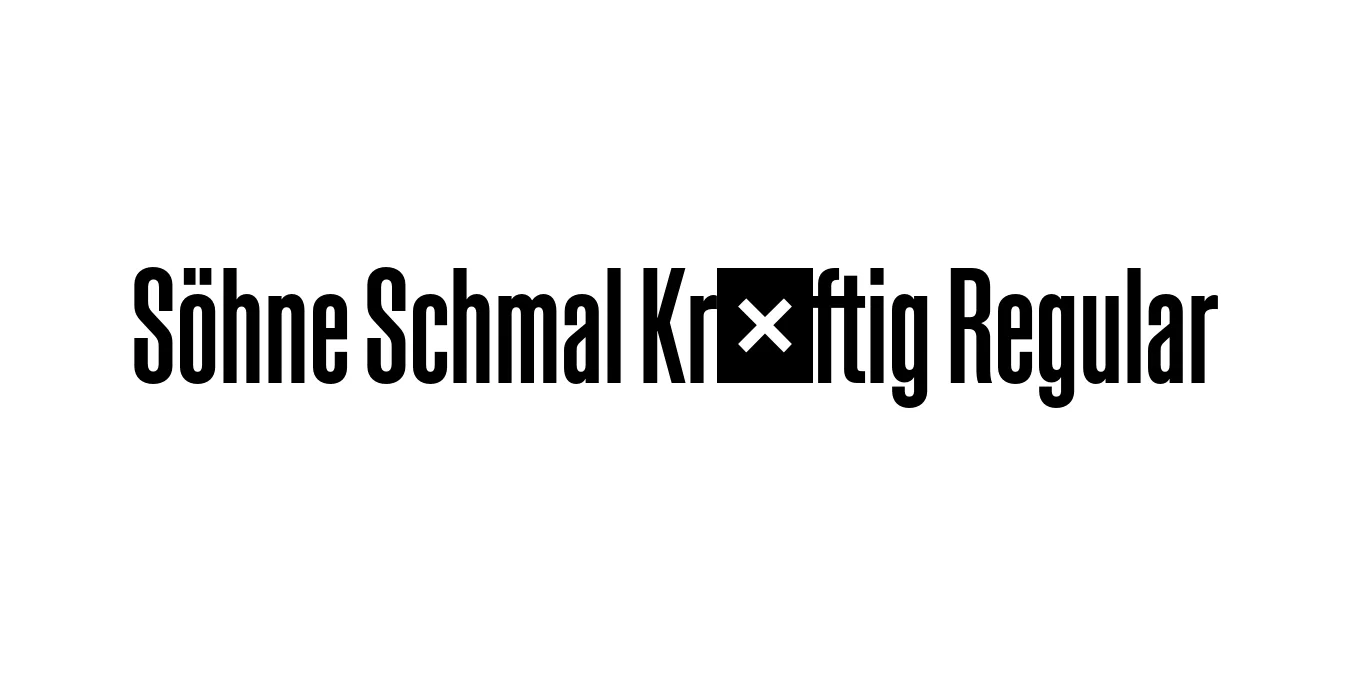
| Font Name | Test Söhne Schmal Kräftig |
| Style | Regular |
| Category | Sans-serif |
| Designer | Kris Sowersby |
| Copyright | Copyright 2023, Kris Sowersby, Klim Type Foundry. |
| License | Free for Personal Use |
| Total Character | 68 |
| Recommended Line Height | 1.33 |
| Ascent | 1037 |
| Descent | 289 |
| Units Per em | 1000 |
| Total Vertical Range | 1326 |
| Max Advance Width | 600 |
| Max Advance Height | N/A |
| Underline Position | -66 |
| Similar Fonts | Akzidenz-Grotesk Bold Condensed, Helvetica Compressed, Univers Bold Condensed |
Söhne Schmal Kräftig Regular Font Details : Font Free Download
Söhne Schmal Kräftig Regular is a distinguished member of the Söhne family, designed by the renowned Kris Sowersby of Klim Type Foundry. The Söhne collection is a contemporary interpretation of the classic Akzidenz-Grotesk, effectively capturing the spirit and materiality of the "Standard" typeface used in the New York City Subway system. This specific variant, Schmal (meaning narrow/condensed) and Kräftig (meaning strong/semi-bold), focuses on delivering a powerful typographic presence within a compact horizontal footprint.
The design philosophy behind Söhne involves a meticulous balance between historical industrial aesthetics and modern digital precision. The Kräftig weight provides a robust visual impact, making it ideal for information-dense environments where clarity and authority are paramount. By combining the heritage of early grotesks with refined technical execution, Söhne Schmal Kräftig serves as a versatile tool for designers looking for a typeface that feels both timeless and engineered for the 21st century.
Söhne Schmal Kräftig Regular Best Uses
Perfect for high-impact titles in magazines and newspapers where space is limited.
Provides a strong, industrial look for large-scale graphics and promotional materials.
Excellent for mobile interfaces and sidebars where horizontal space must be maximized.
Ideal for creating a bold, professional identity in logotypes and signage.
Söhne Schmal Kräftig Regular Glyphs
