Söhne Schmal Leicht Italic
Designed by Kris Sowersby
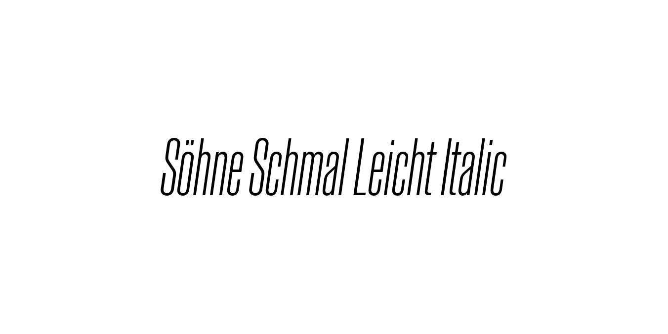
| Font Name | Test Söhne Schmal Leicht |
| Style | Italic |
| Category | Sans Serif |
| Designer | Kris Sowersby |
| Copyright | Copyright 2023, Kris Sowersby, Klim Type Foundry. |
| License | Commercial License Required |
| Total Character | 68 |
| Recommended Line Height | 1.33 |
| Ascent | 1037 |
| Descent | 289 |
| Units Per em | 1000 |
| Total Vertical Range | 1326 |
| Max Advance Width | 701 |
| Max Advance Height | N/A |
| Underline Position | -63 |
| Similar Fonts | Akzidenz-Grotesk Condensed, Helvetica Condensed, Inter, Univers |
Söhne Schmal Leicht Italic Font Details : Font Free Download
Söhne Schmal Leicht Italic is part of the extensive Söhne family, which captures the essential memory of Akzidenz-Grotesk adapted for the digital age. Designed by Kris Sowersby of the Klim Type Foundry, the 'Schmal' (Narrow) and 'Leicht' (Light) variant offers a condensed, delicate proportion that excels in modern typography. It draws inspiration from the iconic aesthetics of the New York City Subway signage, popularized by designers like Massimo Vignelli.
The Italic version provides a sophisticated slant that maintains the structural integrity of the grotesque style while introducing a sense of movement and emphasis. As a staple of contemporary Swiss-style design, this typeface bridges the gap between historical mechanical rigor and high-performance digital functionality, making it a favorite for minimalist branding and high-end editorial layouts.
Söhne Schmal Leicht Italic Best Uses
Ideal for magazine headlines and sophisticated print layouts where space is premium.
Perfect for high-end corporate identities looking for a clean, minimalist aesthetic.
Excellent for condensed menu bars and mobile-responsive interface headers.
Great for impactful, modern ad copy that requires a tight, elegant footprint.
Söhne Schmal Leicht Italic Glyphs

Download Font
Package Size: Unknown
Available Formats: .OTF