Söhne Schmal Leicht Regular
Designed by Kris Sowersby
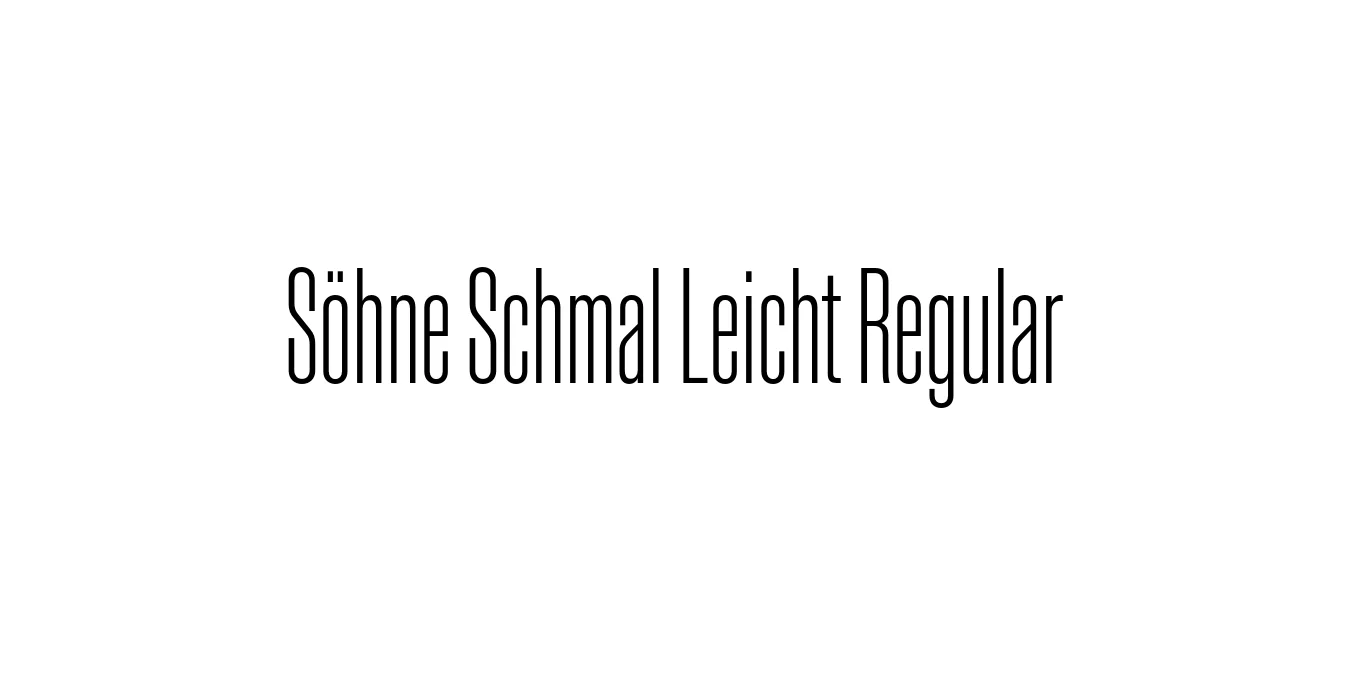
| Font Name | Test Söhne Schmal Leicht |
| Style | Regular |
| Category | Sans-Serif / Condensed Grotesque |
| Designer | Kris Sowersby |
| Copyright | Copyright 2023, Kris Sowersby, Klim Type Foundry. |
| License | Demo |
| Total Character | 68 |
| Recommended Line Height | 1.33 |
| Ascent | 1037 |
| Descent | 289 |
| Units Per em | 1000 |
| Total Vertical Range | 1326 |
| Max Advance Width | 600 |
| Max Advance Height | N/A |
| Underline Position | -63 |
| Similar Fonts | Akzidenz-Grotesk Condensed, Helvetica Compressed, Univers 57 Condensed |
Söhne Schmal Leicht Regular Font Details : Font Free Download
Söhne Schmal Leicht Regular is a refined condensed grotesque that captures the spirit of Akzidenz-Grotesk, distilled for the modern era. Developed by the acclaimed Klim Type Foundry, this typeface serves as a bridge between the historical roots of modernist typography and the contemporary need for high-performance digital fonts. The Schmal (condensed) variant is specifically engineered to handle tight horizontal spaces without sacrificing the character and clarity of the Söhne family.
The Leicht weight provides a delicate, sophisticated aesthetic that is particularly effective in high-end editorial and architectural contexts. Its narrow proportions and precise geometry make it a versatile tool for designers who require a neutral yet authoritative voice in their layouts. Whether used in print or on-screen, it maintains an exceptional level of legibility while embodying the sleek, minimalist principles of Swiss design.
Söhne Schmal Leicht Regular Best Uses
Perfect for sophisticated magazine headlines and dense typographic layouts.
Ideal for compact navigation menus and mobile-first header typography.
Excellent for luxury minimalist logos and sleek corporate identities.
Suited for blueprints, wayfinding, and architectural documentation.
Söhne Schmal Leicht Regular Glyphs

Download Font
Package Size: Unknown
Available Formats: .OTF