Söhne Schmal Regular
Designed by Kris Sowersby (Klim Type Foundry)
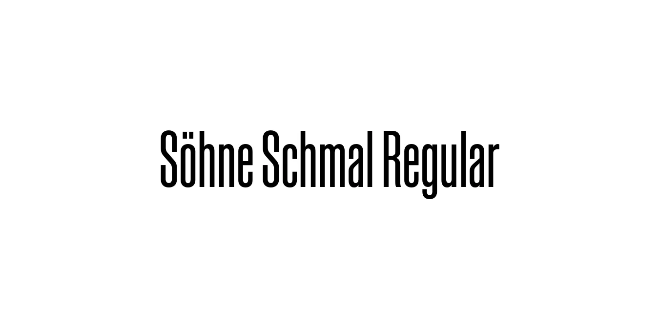
| Font Name | Test Söhne Schmal |
| Style | Regular |
| Category | Sans Serif |
| Designer | Kris Sowersby (Klim Type Foundry) |
| Copyright | Copyright 2023, Kris Sowersby, Klim Type Foundry. |
| License | Commercial / Demo |
| Total Character | 68 |
| Recommended Line Height | 1.33 |
| Ascent | 1037 |
| Descent | 289 |
| Units Per em | 1000 |
| Total Vertical Range | 1326 |
| Max Advance Width | 600 |
| Max Advance Height | N/A |
| Underline Position | -64 |
| Similar Fonts | Helvetica Condensed, Akzidenz-Grotesk Condensed, Univers, Inter, Roboto Condensed |
Söhne Schmal Regular Font Details : Font Free Download
Söhne Schmal Regular is a refined neo-grotesque typeface that captures the 'memory of Akzidenz-Grotesk and the spirit of Helvetica.' Designed by Kris Sowersby, it represents the condensation of the broader Söhne family, aiming to bridge the gap between analogue materiality and digital precision. The 'Schmal' (meaning narrow or slim) variant is specifically engineered for efficiency, offering a compact footprint that maintains incredible legibility and a neutral, professional character.
The typeface is celebrated for its industrial grit and functional clarity. By distilling the best qualities of early 20th-century Swiss design, Söhne Schmal Regular provides designers with a versatile tool for modern layouts. It is particularly effective in environments where horizontal space is at a premium, such as complex editorial grids or dense user interfaces, making it a staple for contemporary typographic projects.
Söhne Schmal Regular Best Uses
Perfect for magazine headlines and body copy in narrow column layouts.
Ideal for clean, high-density user interfaces and mobile navigation menus.
Used for modern corporate identities that require an authoritative and minimalist look.
Effective for impactful messaging in poster design and digital banner ads.
Söhne Schmal Regular Glyphs

Download Font
Package Size: Unknown
Available Formats: .OTF