Specter Inline Ultra
Designed by Coert De Decker (Kustomtype)
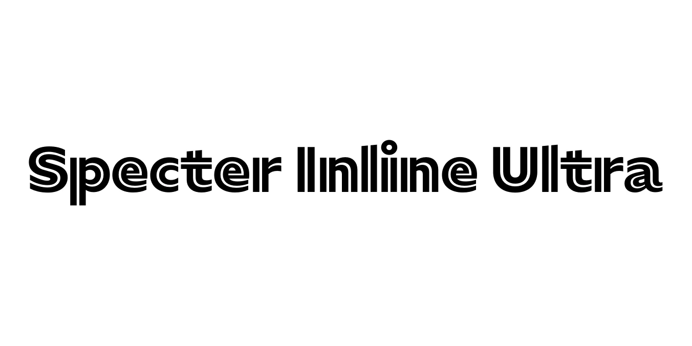
| Font Name | Specter Inline TRIAL Ultra |
| Style | Regular |
| Category | Display / Decorative |
| Designer | Coert De Decker (Kustomtype) |
| Copyright | © 2017 MCKL. All Rights Reserved. |
| License | Free for Personal Use |
| Total Character | 65 |
| Recommended Line Height | 1.38 |
| Ascent | 1029 |
| Descent | 354 |
| Units Per em | 1000 |
| Total Vertical Range | 1383 |
| Max Advance Width | 1129 |
| Max Advance Height | N/A |
| Underline Position | -75 |
| Similar Fonts | Varsity, Princetown, Graduate, Impact Inline |
Specter Inline Ultra Font Details : Font Free Download
Specter Inline Ultra is a commanding display typeface that draws inspiration from mid-century industrial signage and classic collegiate block lettering. Developed as part of a wider font family, this specific Inline Ultra weight emphasizes a heavy, masculine structure with a distinctive negative space line running through the center of the characters, providing a sophisticated layered or 3D appearance.
The design features sharp, slab-like serifs and geometric proportions that ensure readability even at massive sizes. It is frequently utilized in contexts that require a sense of power, speed, and heritage, making it a staple for designers working on vintage-inspired branding and high-energy editorial layouts.
Specter Inline Ultra Best Uses
Ideal for sports team identities, automotive logos, and fitness brands.
Perfect for varsity-style t-shirt graphics and athletic jerseys.
Excellent for high-impact event posters and retro-themed flyers.
Great for large-scale billboards and promotional banners that need to stand out.
Specter Inline Ultra Glyphs
