VantaBlack Regular
Display Sans SerifDesigned by Catur Argi

Designed by Matthieu Cortat
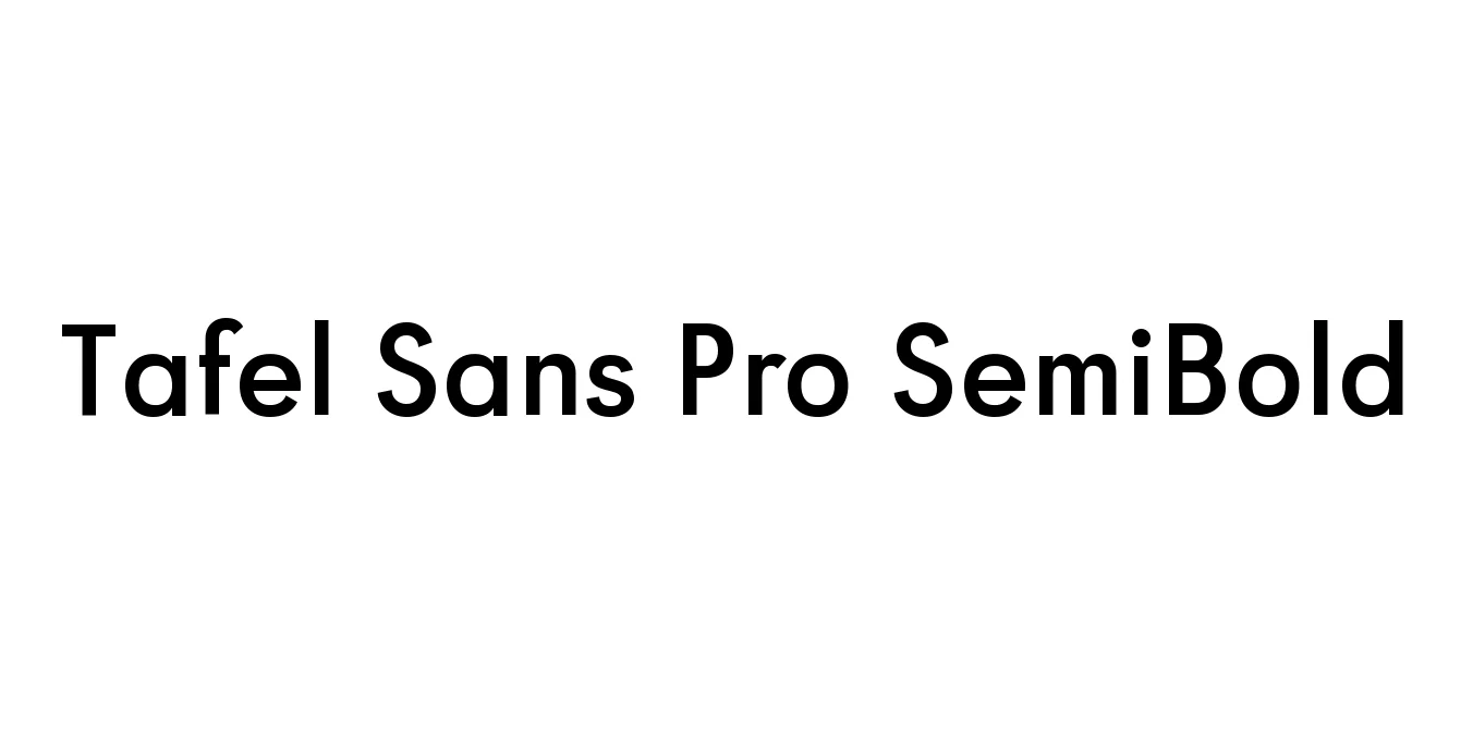
| Font Name | Tafel Sans Pro SemiBold |
| Style | Regular |
| Category | Sans Serif |
| Designer | Matthieu Cortat |
| Copyright | Copyright © 2019 by Alejandro Paul. All rights reserved. |
| License | Demo |
| Total Character | 389 |
| Recommended Line Height | 1.2 |
| Ascent | 2048 |
| Descent | 410 |
| Units Per em | 2048 |
| Total Vertical Range | 2458 |
| Max Advance Width | 3147 |
| Max Advance Height | N/A |
| Underline Position | -256 |
| Similar Fonts | Gill Sans, Frutiger, Myriad Pro |
Tafel Sans Pro SemiBold is a contemporary humanist sans-serif typeface family designed by Matthieu Cortat. It was crafted with a focus on blending the structural clarity of mid-century modernism with the organic warmth of humanist proportions. This specific SemiBold weight provides a robust visual impact, making it ideal for structural hierarchy in complex typographic layouts while maintaining a high degree of elegance and sophistication.
The typeface features a generous x-height and open counters, which ensure maximum legibility even at smaller point sizes or on low-resolution digital screens. Tafel Sans Pro supports a comprehensive range of OpenType features, including multiple figure sets and stylistic alternates, allowing for professional-grade customization. It is widely regarded as a versatile tool that bridges the gap between industrial utility and contemporary aesthetic appeal.
Ideal for creating strong, professional corporate identities and logos.
Perfect for high-readability headlines and primary navigational elements.
Excellent for magazines, brochures, and reports requiring a clean, authoritative look.
Structured and clear, making it suitable for modern application dashboards.

Designed by Catur Argi
Designed by Zenoz Design

Designed by Jim Spiece

Designed by Jim Ford