The Mix Light Italic
Designed by Luc(as) de Groot
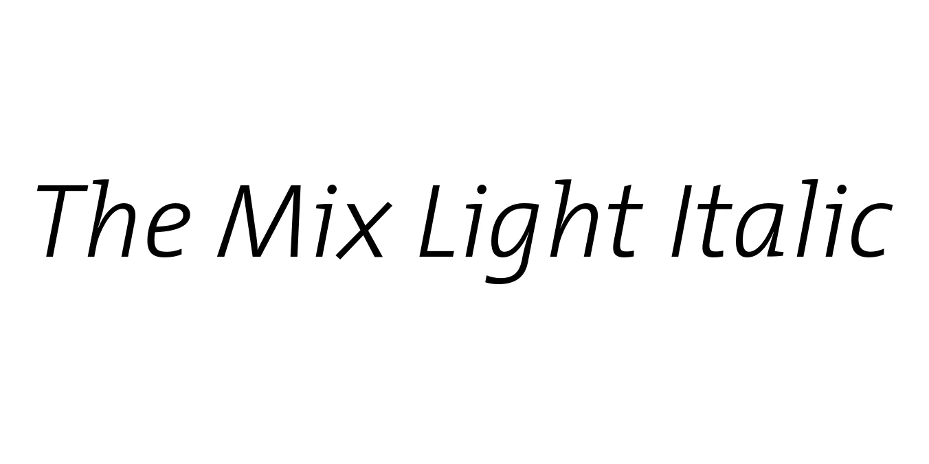
| Font Name | TheMix |
| Style | Light Italic |
| Category | Semi-Serif |
| Designer | Luc(as) de Groot |
| Copyright | Copr. Luc as de Groot 1994 |
| License | Commercial / Paid (Check License for Free Versions) |
| Total Character | 238 |
| Recommended Line Height | 1.59 |
| Ascent | 1164 |
| Descent | 424 |
| Units Per em | 1000 |
| Total Vertical Range | 1588 |
| Max Advance Width | 1963 |
| Max Advance Height | N/A |
| Underline Position | -150 |
| Similar Fonts | TheSans, Rotis Semi Serif, Lucida Sans, Syntax |
The Mix Light Italic Font Details : Font Free Download
The Mix Light Italic is a sophisticated member of the Thesis typeface superfamily, created by the acclaimed Dutch designer Luc(as) de Groot in the mid-1990s. As a semi-serif font, it bridges the gap between the clean lines of a sans-serif and the structured elegance of a slab serif. The 'Light Italic' weight provides a graceful, airy slant that maintains exceptional legibility while adding a touch of humanist warmth and professional flair to any layout.
The development of The Mix was driven by a need for a versatile corporate typeface that could handle everything from complex financial reports to large-scale signage. Its distinct features include low contrast and slightly squared-off shapes that ensure clarity across digital and print mediums. Today, The Mix remains a go-to choice for designers seeking a balance of contemporary style and classic readability, serving as a cornerstone of modern editorial and branding design.
The Mix Light Italic Best Uses
Perfect for creating a unified and professional brand voice across multiple platforms.
Excellent for magazine subheadings, pull quotes, and elegant body copy.
Optimized for high legibility in digital user interfaces and long-form articles.
The clear, open counters make it highly effective for signage and environmental graphics.
The Mix Light Italic Glyphs

Download Font
Package Size: 39.1 KB
Available Formats: .OTF