The Mix Semi Bold
Designed by Luc(as) de Groot
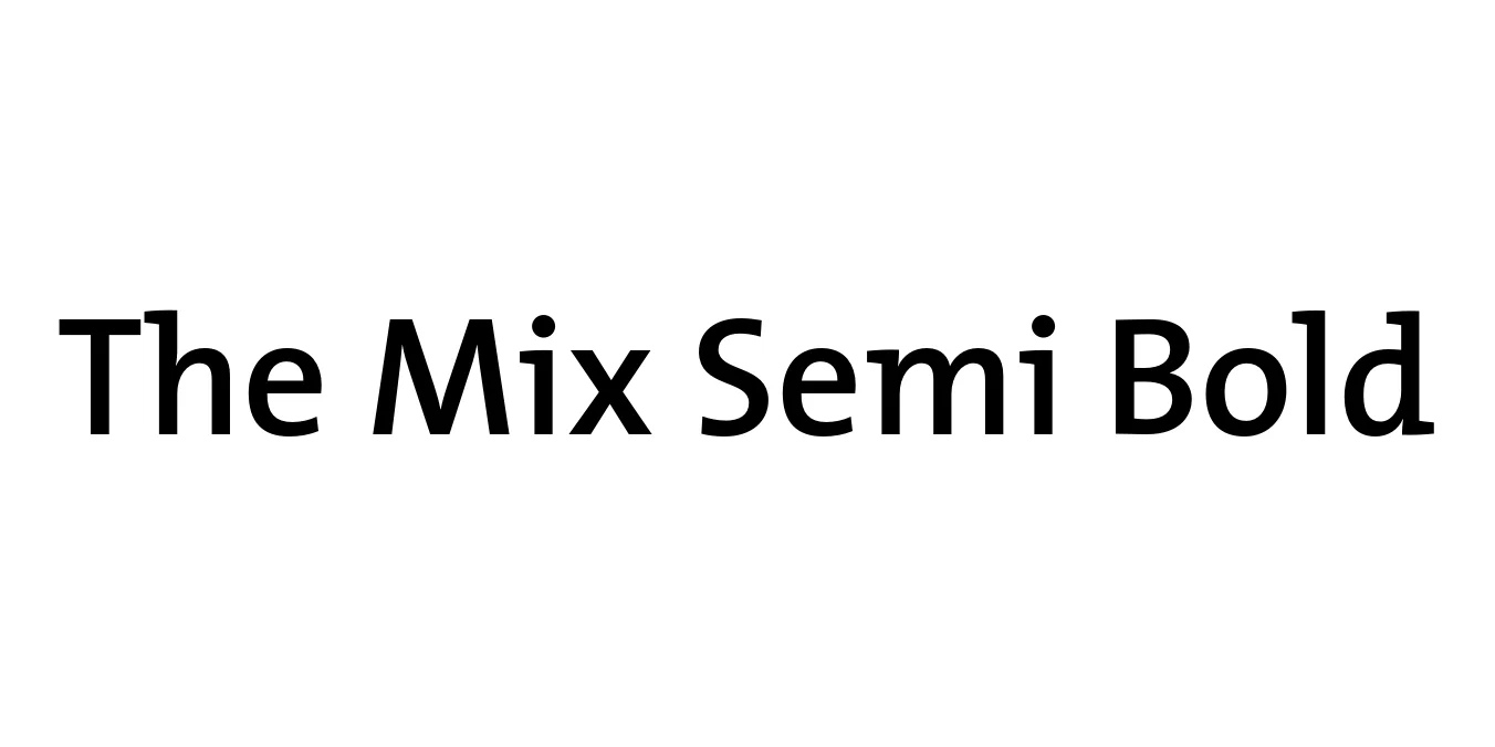
| Font Name | TheMix |
| Style | SemiBold |
| Category | Semi-Serif / Slab Serif |
| Designer | Luc(as) de Groot |
| Copyright | Copr. Luc as de Groot 1994 |
| License | Commercial (Requires License) |
| Total Character | 238 |
| Recommended Line Height | 1.61 |
| Ascent | 1172 |
| Descent | 441 |
| Units Per em | 1000 |
| Total Vertical Range | 1613 |
| Max Advance Width | 1963 |
| Max Advance Height | N/A |
| Underline Position | -150 |
| Similar Fonts | TheSans, TheSerif, Lucida Bright, Corbel, FF Meta |
The Mix Semi Bold Font Details : Font Free Download
The Mix Semi Bold is a prominent member of the extensive Thesis superfamily, designed by the renowned Dutch typographer Luc(as) de Groot in the early 1990s. Characterized as a semi-serif or 'hybrid' typeface, it bridges the gap between sans-serif simplicity and serif legibility. The Semi Bold weight provides a robust presence that makes it ideal for corporate identities and editorial headings where clarity and character are paramount.
Released through the LucasFonts foundry, The Mix was specifically engineered to offer exceptional readability across both print and digital media. Its unique construction—featuring slab-like serifs on only one side of certain letterforms—gives it a modern, technical feel that remains humanistic. Over the decades, it has become a staple for professional branding, used by major corporations and government institutions worldwide due to its versatility and timeless design.
The Mix Semi Bold Best Uses
Perfect for logos and brand messaging due to its distinct, professional look.
Excellent for magazine headers and sub-headlines that require weight and clarity.
Highly legible from a distance, making it suitable for signage and public information.
Bold enough to capture attention in hero sections and navigation menus.
The Mix Semi Bold Glyphs

Download Font
Package Size: 38.3 KB
Available Formats: .OTF