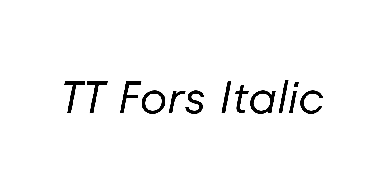
TT Fors Italic
Designed by TypeType Team
| Font Name | TT Fors Trial |
| Style | Italic |
| Category | Geometric Sans Serif |
| Designer | TypeType Team |
| Copyright | Copyright (c) 2021 by TypeType. Designers Pavel Emelyanov, Yulia Gonina, Antonina Zhulkova, Marina Khodak, Radik Tukhvatullin, Eugene Tantsurin. Technical designers Ivan Gladkikh, Yuri Nako, Victor Rubenko. All rights reserved. For font testing only. Special version for DaFont. |
| License | Demo / Free for Personal Use |
| Total Character | 666 |
| Recommended Line Height | 1.4 |
| Ascent | 1050 |
| Descent | 350 |
| Units Per em | 1000 |
| Total Vertical Range | 1400 |
| Max Advance Width | 1570 |
| Max Advance Height | N/A |
| Underline Position | -205 |
| Similar Fonts | Gotham Italic, Montserrat Italic, Futura PT Italic, TT Commons Italic |
TT Fors Italic Font Details : Font Free Download
TT Fors Italic was meticulously developed by the TypeType design studio as part of the broader TT Fors family, a versatile geometric sans-serif engineered for the demands of 21st-century media. The project originated from a desire to create a functional, modern grotesque that synthesizes the logic of early 20th-century geometric types with the technical precision required for high-density screen rendering. Unlike many italics that lean toward the calligraphic, TT Fors Italic serves as a highly refined oblique, maintaining structural consistency with its upright counterparts while providing the necessary visual contrast for emphasis and hierarchy.
Expert analysis of the letterforms reveals a sophisticated balance between circular geometric foundations and an optimized x-height that ensures superior legibility at micro-typographic scales. The visual weight is distributed with mathematical precision, featuring open apertures and generous counters that prevent ink trapping in print and blurring on digital displays. The italic slant is specifically calibrated to preserve the horizontal rhythm of text blocks, avoiding the 'jitter' often associated with more aggressive slopes. This makes it an exceptional choice for technical documentation and complex user interfaces where clarity is paramount.
TT Fors Italic Best Uses
Optimized for high-resolution screens and complex UI components.
Conveys a sense of stability, innovation, and professional clarity.
Perfect for secondary headers, pull quotes, and sophisticated body copy emphasis.
TT Fors Italic Glyphs

Download Font
Package Size: 154.6 KB
Available Formats: .TTF