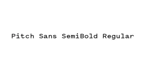
Pitch Sans Regular
Sans SerifDesigned by Kris Sowersby
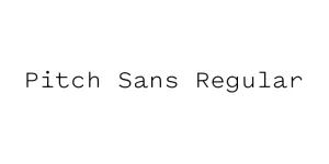
Designed by Sol Hess
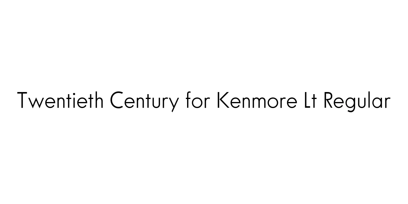
| Font Name | Twentieth Century for Kenmore Lt |
| Style | Regular |
| Category | Geometric Sans Serif |
| Designer | Sol Hess |
| Copyright | Font software Copyright 1997 Adobe Systems Incorporated. Typeface designs Copyright 1997, 2009 The Monotype Corporation. All rights reserved. |
| License | Free for Personal Use |
| Total Character | 263 |
| Recommended Line Height | 1.1 |
| Ascent | 1779 |
| Descent | 480 |
| Units Per em | 2048 |
| Total Vertical Range | 2259 |
| Max Advance Width | 2048 |
| Max Advance Height | N/A |
| Underline Position | -152 |
| Similar Fonts | Futura, Spartan, Avenir, ITC Avant Garde Gothic |
Twentieth Century for Kenmore Lt Regular is a sophisticated geometric sans-serif typeface that originates from the classic Twentieth Century family designed by Sol Hess for Monotype. Initially created between 1937 and 1947 as a direct competitor to Futura, this specific variant was optimized for clarity and professional typesetting. Its design is rooted in the Bauhaus movement, emphasizing pure geometric forms such as circles and straight lines to achieve a clean, functional aesthetic that transcends time.
This particular Light Regular weight provides an elegant and airy feel, making it highly effective for contemporary design projects that require a minimalist touch. The open counters and precise proportions of the letters ensure excellent legibility in both large-scale headlines and small technical copy. It is widely regarded as a staple for designers looking to balance mid-century modernism with the high-performance demands of modern digital and print media.
Ideal for creating high-end, professional logos and corporate identity systems that require a timeless look.
Perfect for layout headers and body text in minimalist magazines, architectural catalogs, and art books.
Suited for clean user interfaces and navigation menus where legibility and modern aesthetics are prioritized.
Excellent for industrial and luxury product packaging that favors a stripped-back, sophisticated graphic style.

Package Size: 91.7 KB
Available Formats: .TTF
Designed by Kris Sowersby
Designed by Kris Sowersby
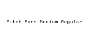
Designed by Kris Sowersby
Designed by Kris Sowersby