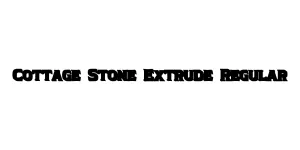
Cottage Stone Extrude Regular
Display / DecorativeDesigned by Mans Greback
Designed by Sol Hess
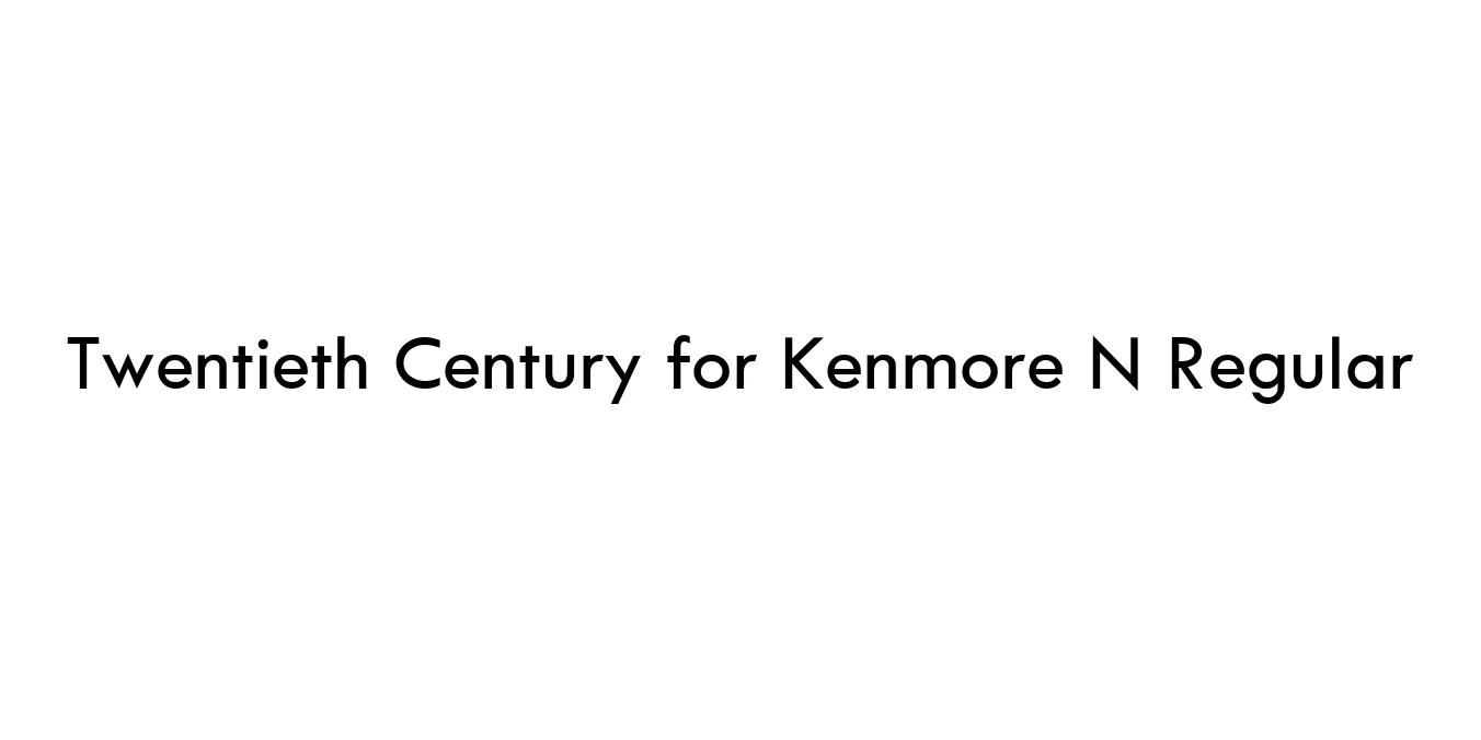
| Font Name | Twentieth Century for Kenmore N |
| Style | Regular |
| Category | Geometric Sans-Serif |
| Designer | Sol Hess |
| Copyright | Copyright © 2021 The Monotype Corporation. All rights reserved. |
| License | Free for Personal Use |
| Total Character | 393 |
| Recommended Line Height | 1 |
| Ascent | 1536 |
| Descent | 512 |
| Units Per em | 2048 |
| Total Vertical Range | 2048 |
| Max Advance Width | 2367 |
| Max Advance Height | N/A |
| Underline Position | -205 |
| Similar Fonts | Futura, Spartan, ITC Avant Garde Gothic |
Twentieth Century for Kenmore N Regular is a classic geometric sans-serif typeface rooted in the mid-20th-century design movement. Originally designed by Sol Hess between 1936 and 1947 for the Monotype Corporation, it was developed as a direct competitor to the popular Futura. This specific variant was historically utilized for corporate branding and retail applications, maintaining the clean, minimalist lines that define the Bauhaus-influenced aesthetic.
The font features circular proportions and sharp, geometric constructions that lend it a modern and timeless feel. Its high legibility and balanced weight make it a versatile choice for both display and body text. Over the decades, Twentieth Century has become a staple in graphic design, frequently utilized for technical manuals, advertising, and corporate identities that require a sense of precision and clarity.
Perfect for bold, eye-catching headlines in print and digital media.
Ideal for logos and identity systems requiring a clean, professional look.
High legibility makes it suitable for modern web and app interfaces.
Sharp geometry aids in clear communication for manuals and guides.

Package Size: 121.0 KB
Available Formats: .TTF
Designed by Mans Greback
Designed by Thomas Aradea (Letterara)

Designed by Letterhend Studio

Designed by Neale Davidson (Pixel Sagas)