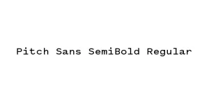
Pitch Sans Regular
Sans SerifDesigned by Kris Sowersby
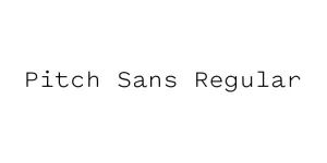
Designed by Sol Hess
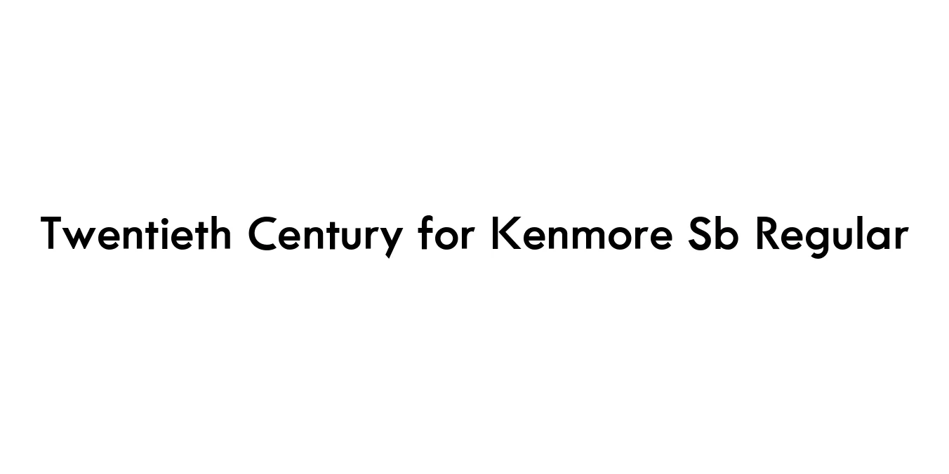
| Font Name | Twentieth Century for Kenmore Sb |
| Style | Regular |
| Category | Geometric Sans-Serif |
| Designer | Sol Hess |
| Copyright | Font software Copyright 1997 Adobe Systems Incorporated. Typeface designs Copyright 1997, 2009 The Monotype Corporation. All rights reserved. |
| License | Free for Personal Use |
| Total Character | 263 |
| Recommended Line Height | 1.1 |
| Ascent | 1779 |
| Descent | 480 |
| Units Per em | 2048 |
| Total Vertical Range | 2259 |
| Max Advance Width | 2773 |
| Max Advance Height | N/A |
| Underline Position | -152 |
| Similar Fonts | Futura, Spartan, ITC Avant Garde Gothic, Kabel |
Twentieth Century for Kenmore Sb Regular is a sophisticated geometric sans-serif typeface that serves as a refined alternative to early 20th-century classics like Futura. Originally designed by Sol Hess for Monotype between 1937 and 1947, this particular cut was adapted for specific branding requirements, notably for the Kenmore brand, to provide a clean, functional, and modern aesthetic. Its design is characterized by perfectly circular 'O's and sharp, clean lines that embody the spirit of the Bauhaus movement and modernist design principles.
The Scangraphic (Sb) digital version ensures high-quality rendering and precise kerning, making it suitable for both professional printing and high-resolution digital displays. This font's minimalist structure allows it to remain highly legible even at smaller sizes, while its bold geometric shapes make it stand out in display use. It is a timeless choice for designers looking for a typeface that balances technical precision with mid-century elegance, ensuring a professional look for any project.
Perfect for logo design and company stationary requiring a stable, modern feel.
The clear, open shapes make it excellent for technical documentation and user guides.
Works well for clean navigation bars and minimalist body text in UI/UX design.
Ideal for high-end fashion or appliance advertising where a clean, premium look is needed.

Package Size: 90.5 KB
Available Formats: .TTF
Designed by Kris Sowersby
Designed by Kris Sowersby
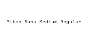
Designed by Kris Sowersby
Designed by Kris Sowersby