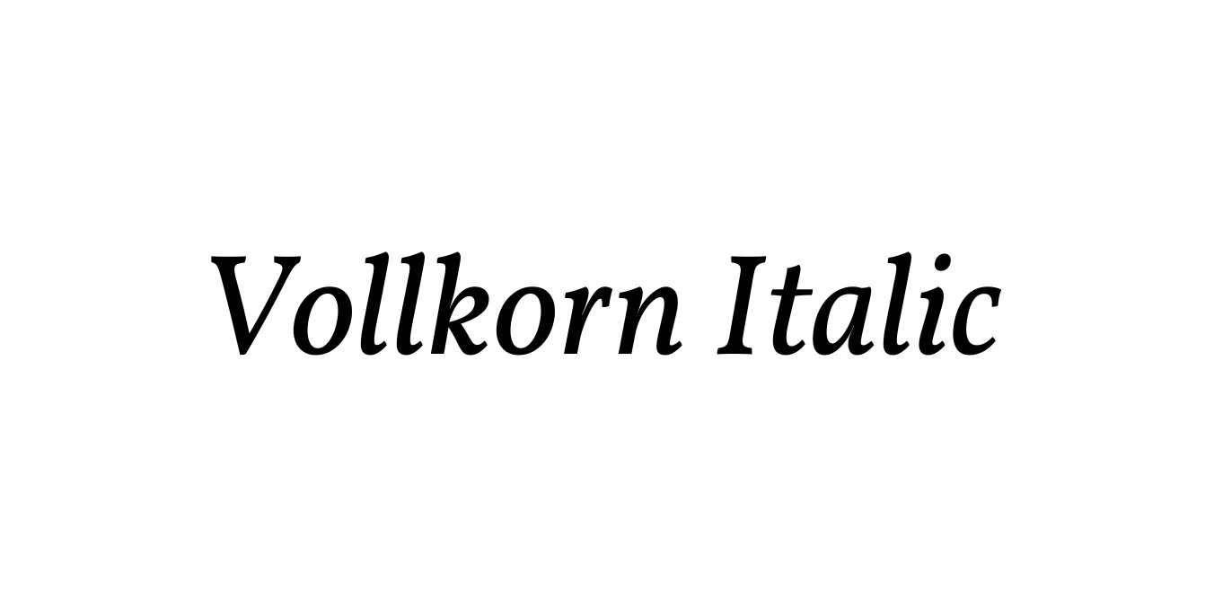
Vollkorn Italic
Designed by Friedrich Althausen
| Font Name | Vollkorn |
| Style | Italic |
| Category | Serif |
| Designer | Friedrich Althausen |
| Copyright | Copyright (c) 2005-2014, Friedrich Althausen (http://friedrichalthausen.de [email protected]). All rights reserved. |
| License | Free For Commercial Use |
| Total Character | 383 |
| Recommended Line Height | 1.2 |
| Ascent | 958 |
| Descent | 242 |
| Units Per em | 1000 |
| Total Vertical Range | 1200 |
| Max Advance Width | 1011 |
| Max Advance Height | N/A |
| Underline Position | 0 |
| Similar Fonts | Georgia, Crimson Text, EB Garamond, PT Serif |
Vollkorn Italic Font Details : Font Free Download
Vollkorn Italic is the slanted companion to the widely celebrated Vollkorn serif family, designed by Friedrich Althausen. Launched in 2005 as Althausen's first typeface project, it was developed with the intention of being a robust, 'whole grain' typeface that functions perfectly as a workhorse for body text. The italic variant maintains the grounded, slightly heavy-set aesthetic of the roman weight, providing a graceful yet sturdy rhythm that aids in reading flow and emphasis within long-form text.
The typeface is defined by its generous x-height, rounded terminals, and strong serifs, which ensure high legibility even on low-resolution digital screens. As an open-source project, it has evolved through various updates, becoming a staple in both web and print design due to its organic feel and professional execution. Its name, which translates to 'Whole Grain' in German, reflects its humble yet essential nature in the world of modern typography.
Vollkorn Italic Best Uses
Ideal for long-form storytelling, magazine layouts, and literary journals.
Highly effective for content-heavy blogs and news websites requiring high legibility.
Suitable for brands that want to convey an organic, traditional, and reliable image.
Excellent for book typesetting, academic papers, and professional reports.
Vollkorn Italic Glyphs
