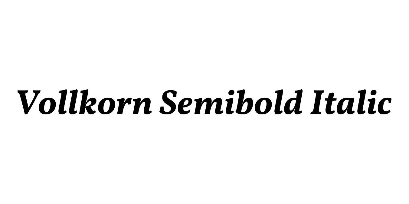
Vollkorn Semibold Italic
Designed by Friedrich Althausen
| Font Name | Vollkorn Semibold |
| Style | Italic |
| Category | Serif |
| Designer | Friedrich Althausen |
| Copyright | Copyright (c) 2005-2014, Friedrich Althausen (http://friedrichalthausen.de [email protected]). All rights reserved. |
| License | Free For Commercial Use |
| Total Character | 383 |
| Recommended Line Height | 1.2 |
| Ascent | 958 |
| Descent | 242 |
| Units Per em | 1000 |
| Total Vertical Range | 1200 |
| Max Advance Width | 1044 |
| Max Advance Height | N/A |
| Underline Position | 0 |
| Similar Fonts | Lora, EB Garamond, PT Serif, Crimson Text |
Vollkorn Semibold Italic Font Details : Font Free Download
Vollkorn was designed by Friedrich Althausen and first released in 2005. It was intended to be a quiet, modest, and highly readable typeface for body text, bridging the gap between historical serif traditions and modern digital requirements. The name "Vollkorn" translates to "whole grain" in German, which reflects the font's hearty, robust, and earthy character, making it a reliable staple for typographers worldwide.
The Semibold Italic weight adds a layer of sophisticated emphasis to the family. With its bouncy, fluid strokes and sturdy serifs, it provides excellent contrast and dynamism within a layout. As one of the first high-quality free font families provided for the web, it has gained immense popularity for its exceptional legibility on screens and its timeless, scholarly aesthetic in print media.
Vollkorn Semibold Italic Best Uses
Excellent for long-form articles, magazines, and literary publications.
Optimized for high legibility as a body font on digital screens.
Suitable for artisanal, organic, or professional corporate identities.
The classic serif look is perfect for thesis papers and journals.
Vollkorn Semibold Italic Glyphs
