Bleach Normal
Display / SerifDesigned by Nirmal Biswas
Designed by Chequered Ink
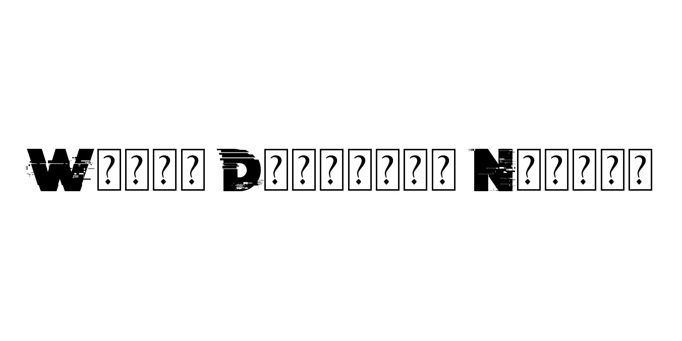
| Font Name | Wrong Delivery |
| Style | Normal |
| Category | Display |
| Designer | Chequered Ink |
| Copyright | Imagex 2021. All Rights Reserved |
| License | Free for Personal Use |
| Total Character | 63 |
| Recommended Line Height | 1.13 |
| Ascent | 1900 |
| Descent | 418 |
| Units Per em | 2048 |
| Total Vertical Range | 2318 |
| Max Advance Width | 2281 |
| Max Advance Height | N/A |
| Underline Position | -217 |
| Similar Fonts | Harting, Old Newspaper Types, Tumbly |
Wrong Delivery Normal is a distinctive display typeface created by the prolific design studio Chequered Ink. Characterized by its gritty, distorted appearance, this font mimics the look of a malfunctioning printer or a stamp that has been struck unevenly, lending it a raw, industrial aesthetic. The jagged edges and inconsistent ink bleed create a sense of urgency and chaos, making it a standout choice for projects that require a touch of urban decay or experimental flair.
Beyond its visual appeal, the font excels in high-impact scenarios where legibility is balanced with artistic expression. It has become a popular choice for album covers, streetwear branding, and poster designs that aim to challenge traditional typographic norms. Despite its weathered look, the Normal weight maintains enough structural integrity to remain readable, ensuring that your message remains impactful within its unique, glitch-inspired textures.
Ideal for posters, flyers, and album artwork seeking an edgy, distressed look.
Perfect for streetwear labels or alternative lifestyle brands needing a raw identity.
Great for horror-themed websites or glitch-art social media graphics.

Package Size: 62.6 KB
Available Formats: .TTF
Designed by Nirmal Biswas
Designed by Umbro Design Team
Designed by Umbro Design Team
Designed by The Voice Branding Team / Unknown