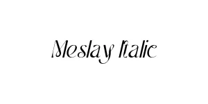
ITC Franklin Gothic Std Bk Cp Italic
Sans SerifDesigned by Morris Fuller Benton, Vic Caruso
Designed by Robin Nicholas, Patricia Saunders
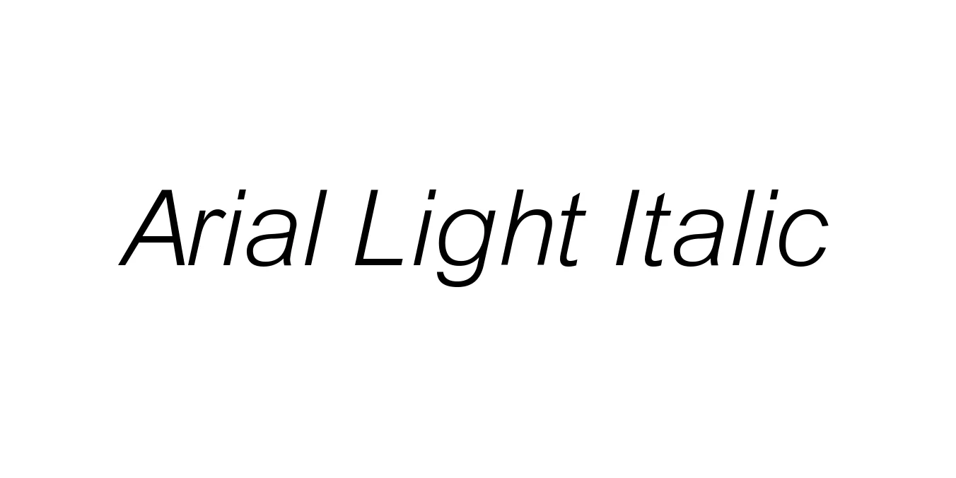
| Font Name | Arial Light |
| Style | Italic |
| Category | Neo-Grotesque Sans Serif |
| Designer | Robin Nicholas, Patricia Saunders |
| Copyright | (C)1992 The Font Company Inc., ALL Rights Reserved |
| License | Free for Personal Use / Commercial License Required |
| Total Character | 220 |
| Recommended Line Height | 1.12 |
| Ascent | 868 |
| Descent | 250 |
| Units Per em | 1000 |
| Total Vertical Range | 1118 |
| Max Advance Width | 931 |
| Max Advance Height | N/A |
| Underline Position | -120 |
| Similar Fonts | Helvetica Light Italic, Roboto Light Italic, Arimo, Inter Light Italic |
Arial was originally conceived in 1982 by a team led by Robin Nicholas and Patricia Saunders for Monotype Typography. Designed as a versatile neo-grotesque sans-serif, it was intended to function seamlessly across various digital and print resolutions, eventually becoming a staple of the Windows operating system. The Light Italic variant emerged as part of the family’s expansion, offering a more refined, less dense alternative to the standard weight. While frequently compared to Helvetica, Arial's design history is rooted in the Grotesque style of the late 19th century, specifically optimized for early IBM laser printers to ensure maximum character clarity.
From a technical standpoint, Arial Light Italic is characterized by a high x-height and open counters, which ensure exceptional legibility even at reduced point sizes. The 'italic' style is technically an oblique—a slanted version of the upright Roman—rather than a redesigned cursive script, maintaining the terminal angles and proportions of the standard light weight. The Light weight significantly alters the font’s color on the page, stripping away the utilitarian thickness of the regular variant to reveal a more delicate, sophisticated skeletal structure. This reduction in visual weight allows the rhythmic slant of the letterforms to create a graceful, forward-leaning motion that is ideal for long-form editorial accents without overwhelming the surrounding text.
Perfect for pull quotes, captions, and subtle sidebars in magazines.
Ideal for secondary UI elements where a light, non-obtrusive touch is needed.
Works well for sub-headers and technical notations in professional reports.

Package Size: 23.2 KB
Available Formats: .TTF
Designed by Morris Fuller Benton, Vic Caruso
Designed by Noheul Lee
Designed by Noheul Lee
Designed by Jean-Baptiste Levée