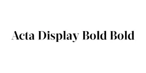
TRIAL Rooftop Bold
Sans SerifDesigned by Martin Vácha
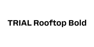
Designed by Adrian Frutiger
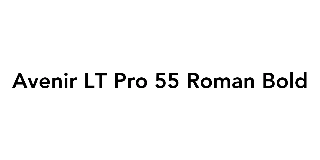
| Font Name | Avenir LT Pro 55 Roman |
| Style | Bold |
| Category | Sans Serif |
| Designer | Adrian Frutiger |
| Copyright | Part of the digitally encoded machine readable outline data for producing the Typefaces provided is copyrighted © 2007 Linotype GmbH, www.linotype.com. All rights reserved. This software is the property of Linotype GmbH, and may not be reproduced, used, displayed, modified, disclosed or transferred without the express written approval of Linotype GmbH. The digitally encoded machine readable software for producing the Typefaces licensed to you is copyrighted (c) 1989, 1995 Adobe Systems. All Rights Reserved. This software is the property of Adobe Systems Incorporated and its licensors, and may not be reproduced, used, displayed, modified, disclosed or transferred without the express written approval of Adobe. Avenir is a trademark of Linotype GmbH and may be registered in certain jurisdictions. This typeface is original artwork of Adrian Frutiger. The design may be protected in certain jurisdictions. |
| License | Commercial (License Required) |
| Total Character | 386 |
| Recommended Line Height | 1.19 |
| Ascent | 939 |
| Descent | 250 |
| Units Per em | 1000 |
| Total Vertical Range | 1189 |
| Max Advance Width | 1167 |
| Max Advance Height | N/A |
| Underline Position | -75 |
| Similar Fonts | Futura, Gotham, Montserrat, Nunito |
Released in 1988, Avenir was designed by the legendary Adrian Frutiger. The name means "future" in French, signaling Frutiger's intent to create a typeface that interpreted the geometric sans-serif style—popularized by Futura—with a more organic, humanistic touch. Unlike its predecessors, Avenir is not purely geometric; its vertical strokes are slightly thicker than the horizontals, and its "o" is not a perfect circle, which improves legibility and provides a more harmonious optical balance.
The Avenir LT Pro 55 Roman weight is often considered the heart of the family, providing a perfect balance for long-form text and professional branding. Over the decades, it has become a staple in corporate identities and urban wayfinding due to its timeless aesthetic and exceptional clarity. It remains one of the most versatile fonts in modern typography, bridging the gap between rigid geometry and approachable design.
Ideal for logos and brand guidelines due to its professional and neutral tone.
Excellent for body text and navigation menus, ensuring high readability across screens.
Perfect for brochures, magazines, and annual reports that require a sophisticated look.
Commonly used in wayfinding systems because of its clear character recognition.

Package Size: 44.4 KB
Available Formats: .OTF
Designed by Martin Vácha
Designed by Martin Vácha
Designed by Jean-Baptiste Morizot
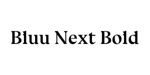
Designed by Dino dos Santos